Boston Calling: The More The Terrier
First celebrated in 2013, Boston Calling is a music festival that originally took place at Boston City Hall Plaza twice a year and would attract between 20,000 and 22,000 people. In 2017 it switched to being held only once a year and moved to the bigger Harvard Athletic Complex where it has attracted over 40,000 attendees since. The festival was co-founded by Brian Appel and Mike Snow, both in the marketing departments of The Phoenix (a newspaper) and WFNX (a radio station) respectively, who enlisted the help of co-curator Aaron Dessner of The National and event production company Crash Line Productions. Over the years, the festival has been headlined by performers like Kendrick Lamar, Sia, Beck, Eminem, Mumford and Sons, and many more. The 2020 festival was cancelled due to COVID, which was then postponed to May of 2021 and earlier this year it was decided to further postpone it to 2022. Since 2020, the festival already had headliners Foo Fighters and Rage Against the Machine as well as a new identity designed in collaboration by New York, NY-based Contino Studio and Boston, MA-based Colossus that, two years later, is being fully deployed as the festival aims to resume next Memorial Day.
Note: Some of the images display the 2020 date from back in the distant past when Contino and Colossus were first hired to take this on.
The new look [for the icon] is simplified, graphic and has a more focused, Bostonian glare letting you know he means business. [It was an] exercise in finding the proper amount of “Boston” to inject into the revised facial features.
Contino Studio project page
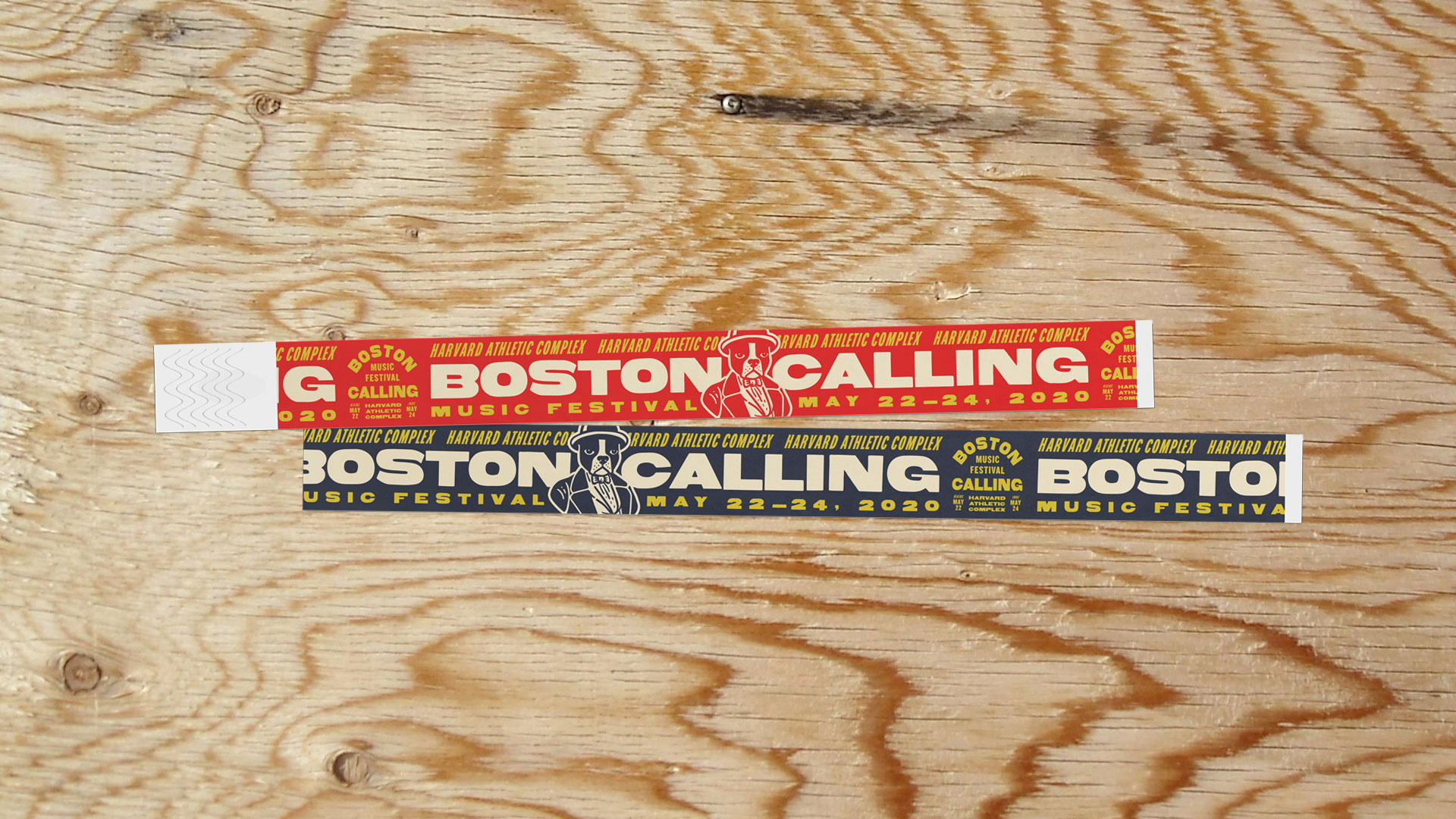
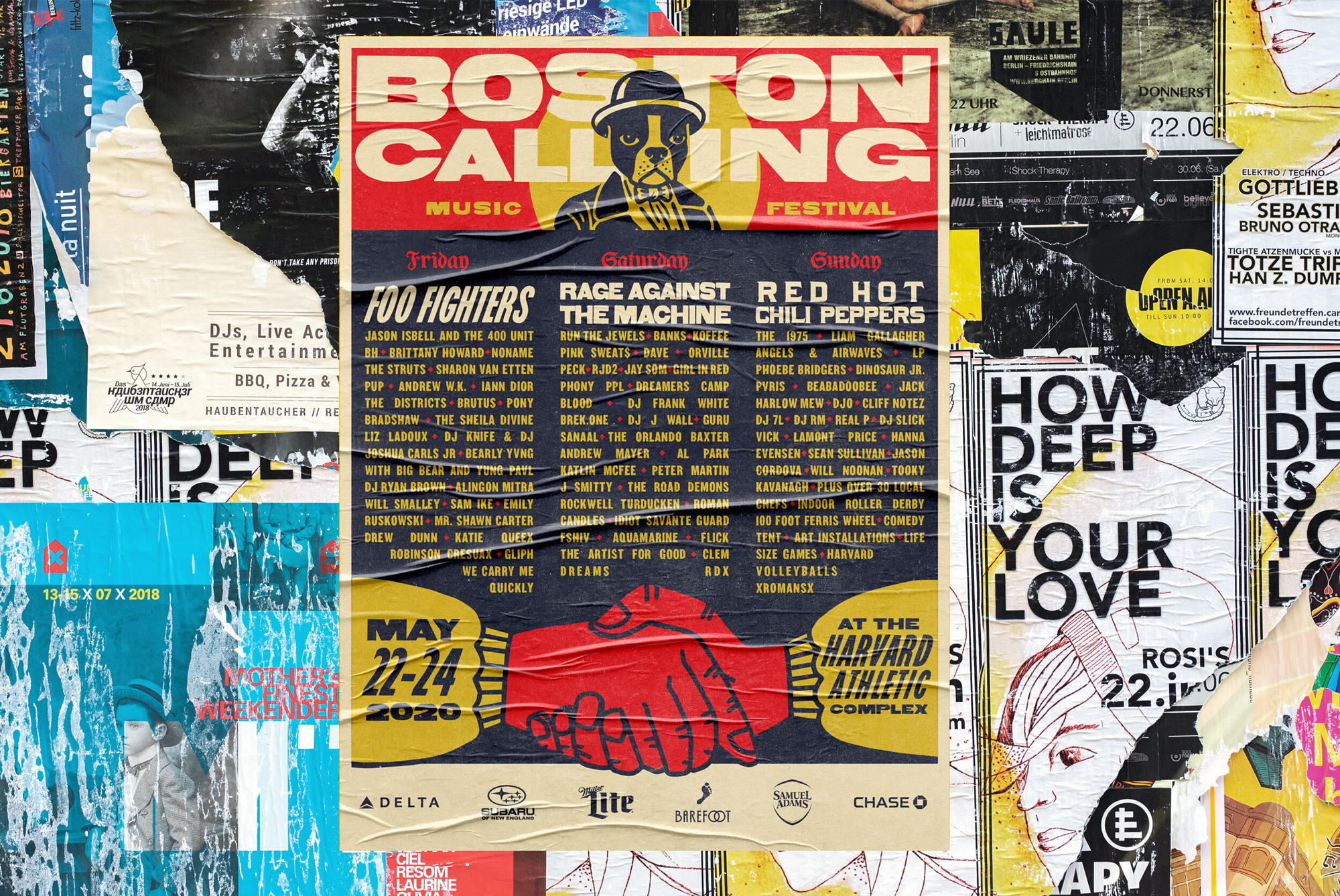
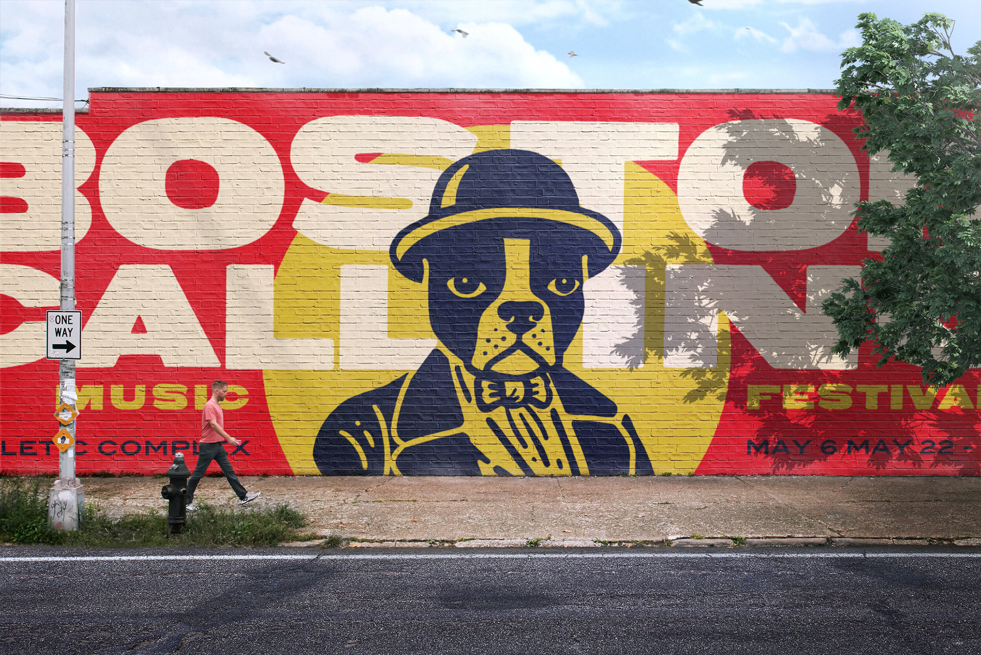
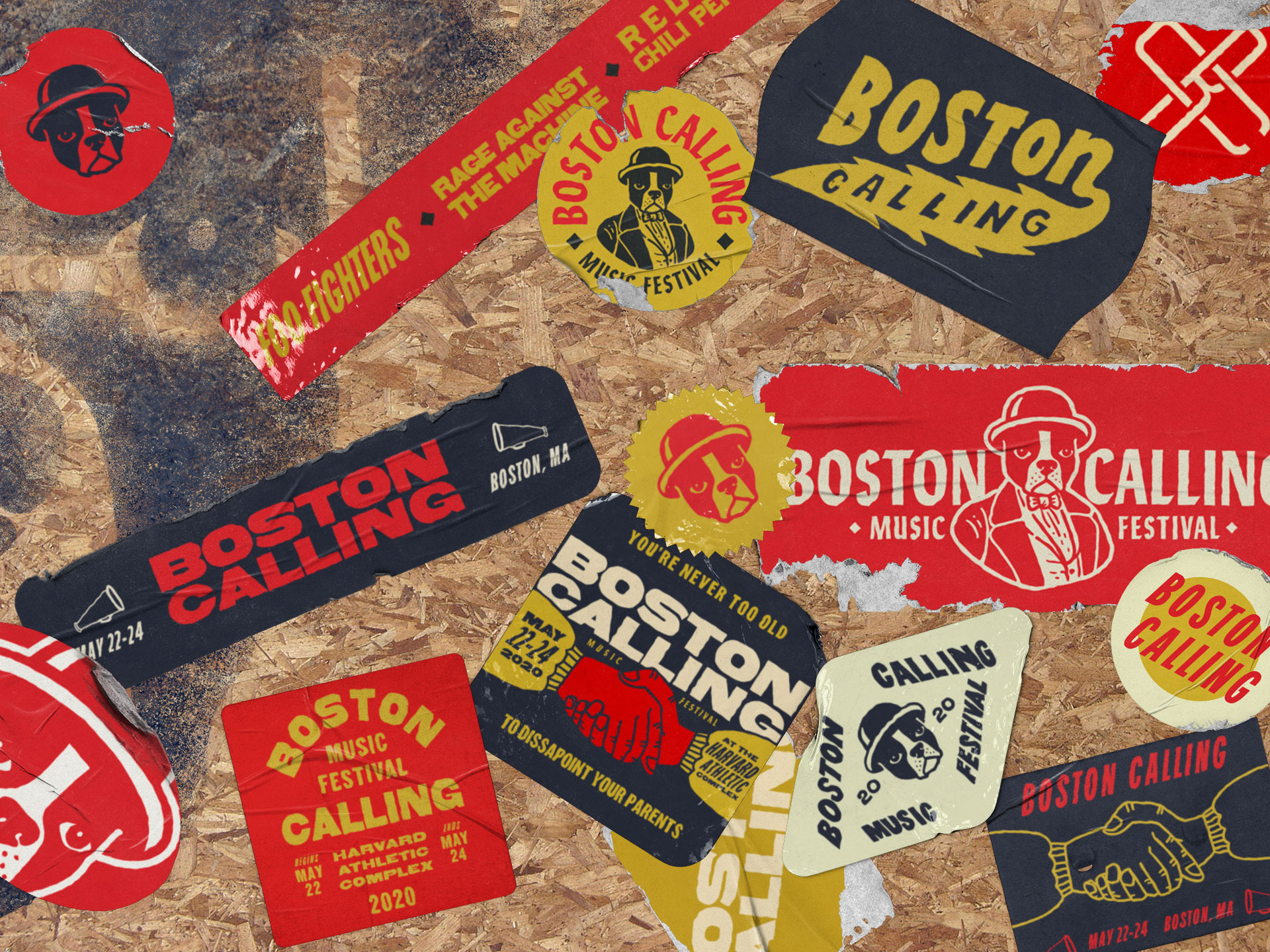
The woodcut-like illustration of a Boston Terrier wearing a bowl hat and a suit dates back to the festival’s original logo that featured typography that mimicked dollar bills, which made the illustration of the dog look like it was a former President and made sense together. As the wordmark evolved for the festival into what we see today as the “before” it lost that bank note vibe and just started to look like a random illustration paired with a random typeface and became a pretty uninspiring logo that I am sure was also a pain to reproduce in the myriad needs of the festival.
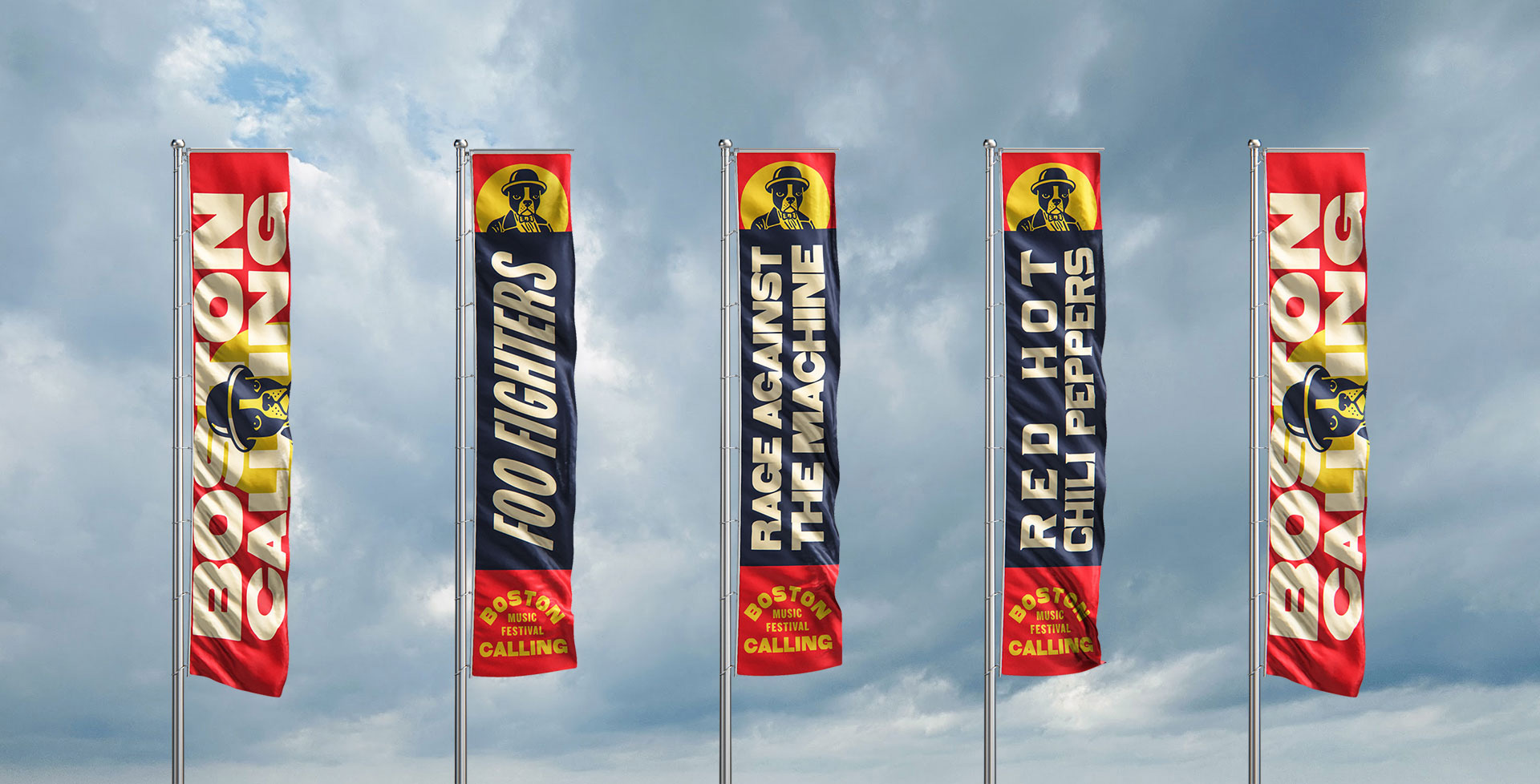
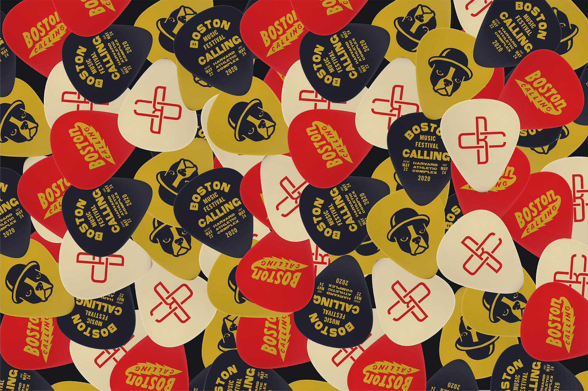
The new Boston Terrier is now rendered with thick lines and just the right amount of detail that maintains the vintage texture and aesthetic while also making it much more reproducible at small sizes and in different production techniques. It also looks far more bad-ass with an expression of a dog that is not amused but also confident AF. If it were the logo for a pet store, sure, it would be uninviting and a little passive aggressive, but for a kick-ass music festival, its attitude is just right. The dog has been paired with a groovy, calligraphic sans serif and, almost like a sports icon, can be used with its fuller body drawing or as a floating head, both of which rock.
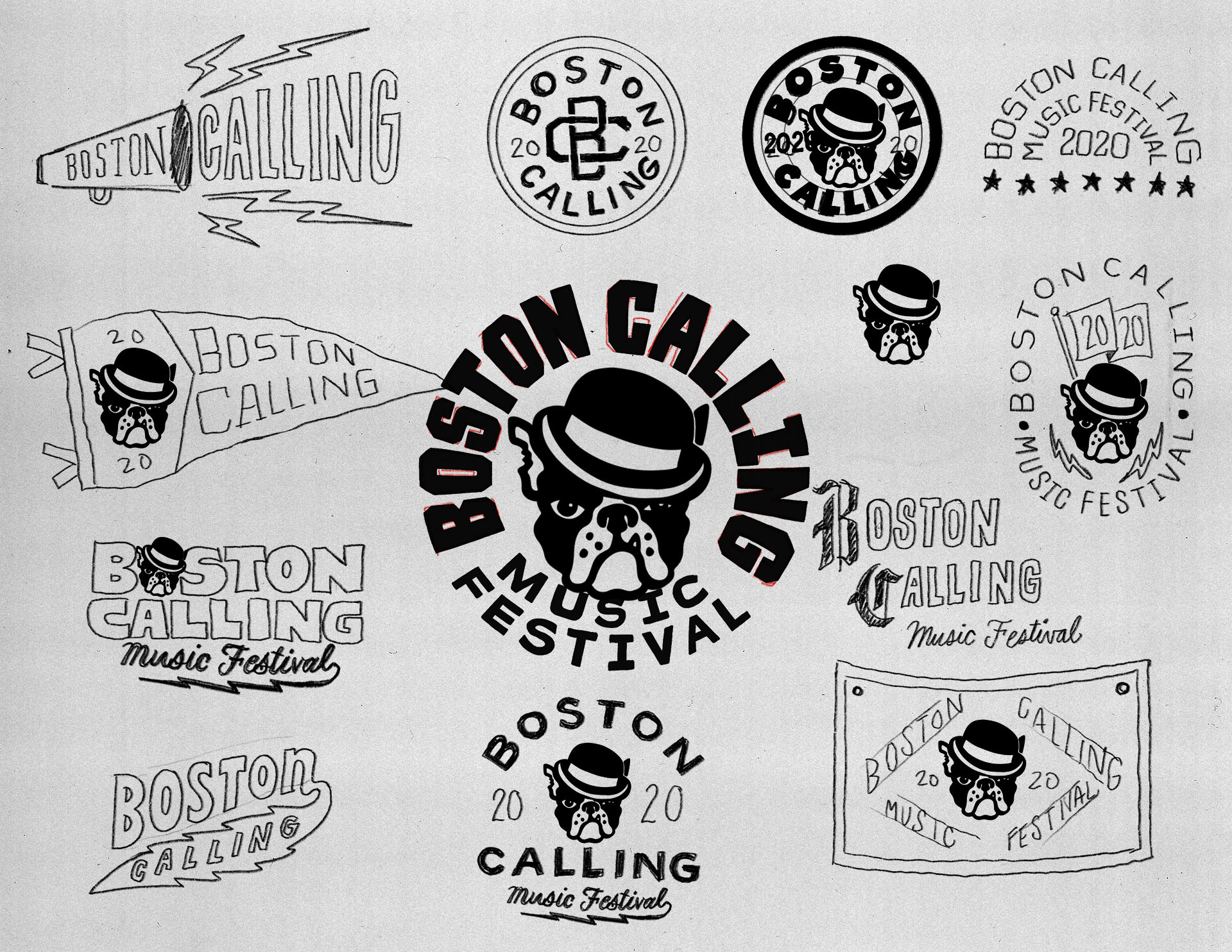
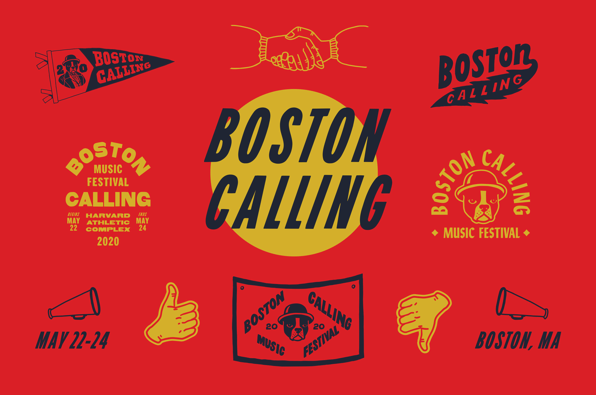
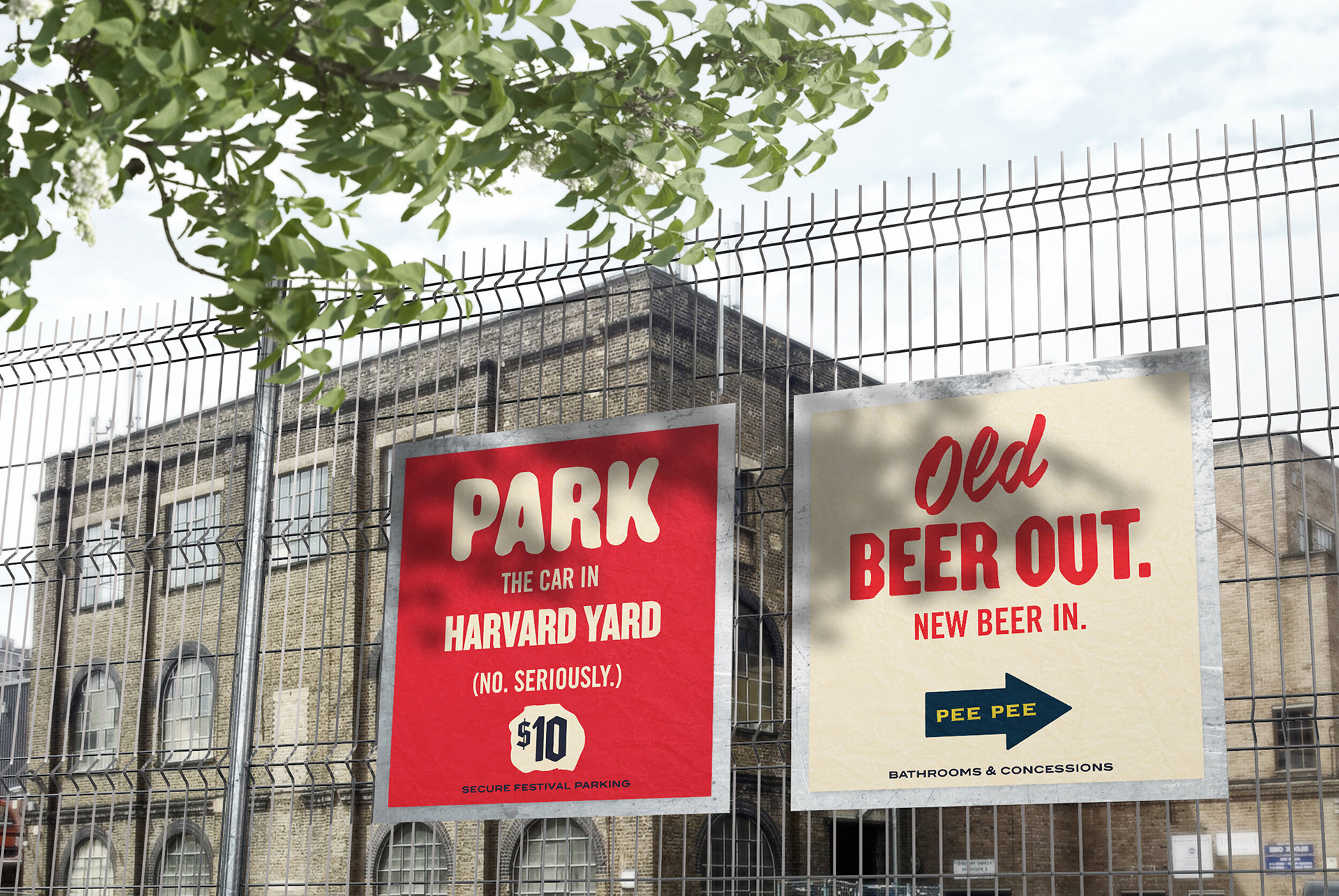
As with most Contino projects, there is a cavalcade of badges and doodads and thingies that are perhaps unrelated to each other but, put together and deployed judiciously, they help create a more rounded mood that I will not try to define myself but instead quote Colossus’ Instagram post who describe said mood as a combination of “the old world aesthetics of historic Boston with nods to Ivy League collegiate style, DIY punk shows and vintage newspaper printing”. In my mind this whole identity sounds like one of my favorite songs to play when I need a pick-me-up, Dropkick Murphys’ “I’m Shipping Up To Boston”.
Combining classic “rock and roll kickassery” with a snarky, chip-on-the-shoulder Bostonian mindset. We created a soup-to-nuts, integrated campaign that harkened back to the festival’s roots.
Colossus project page

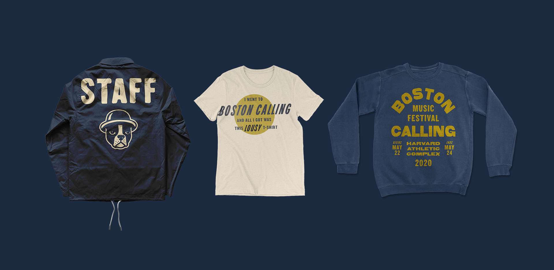
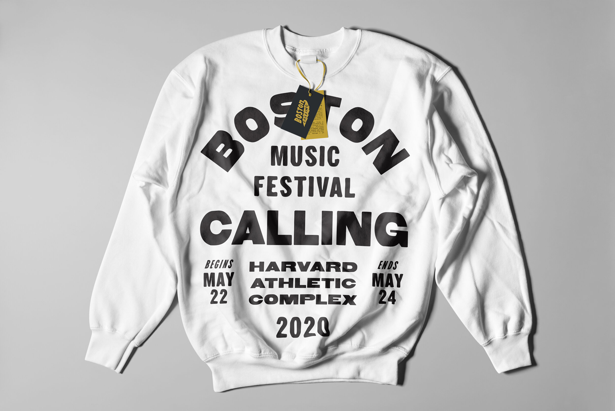

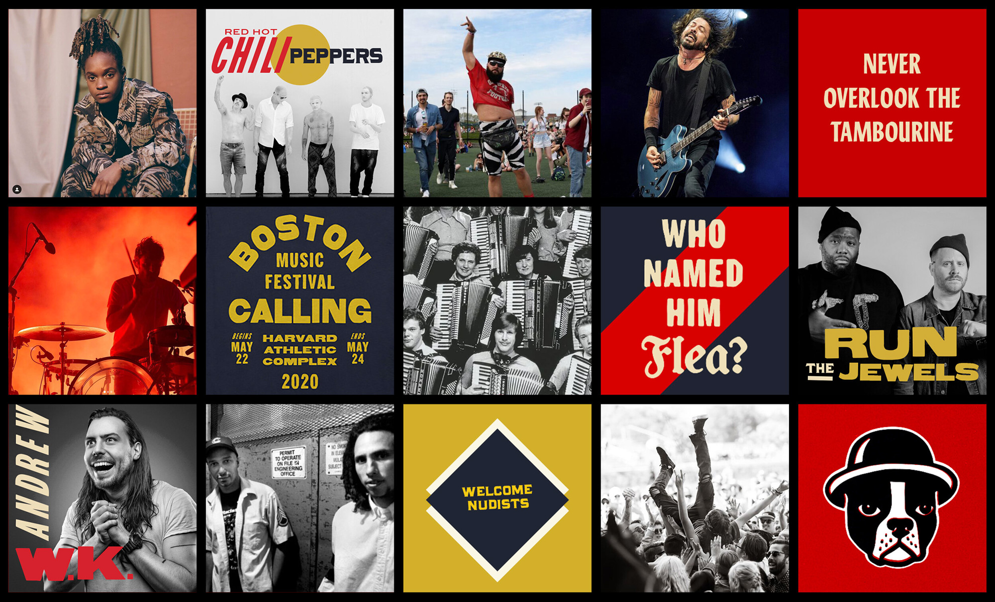
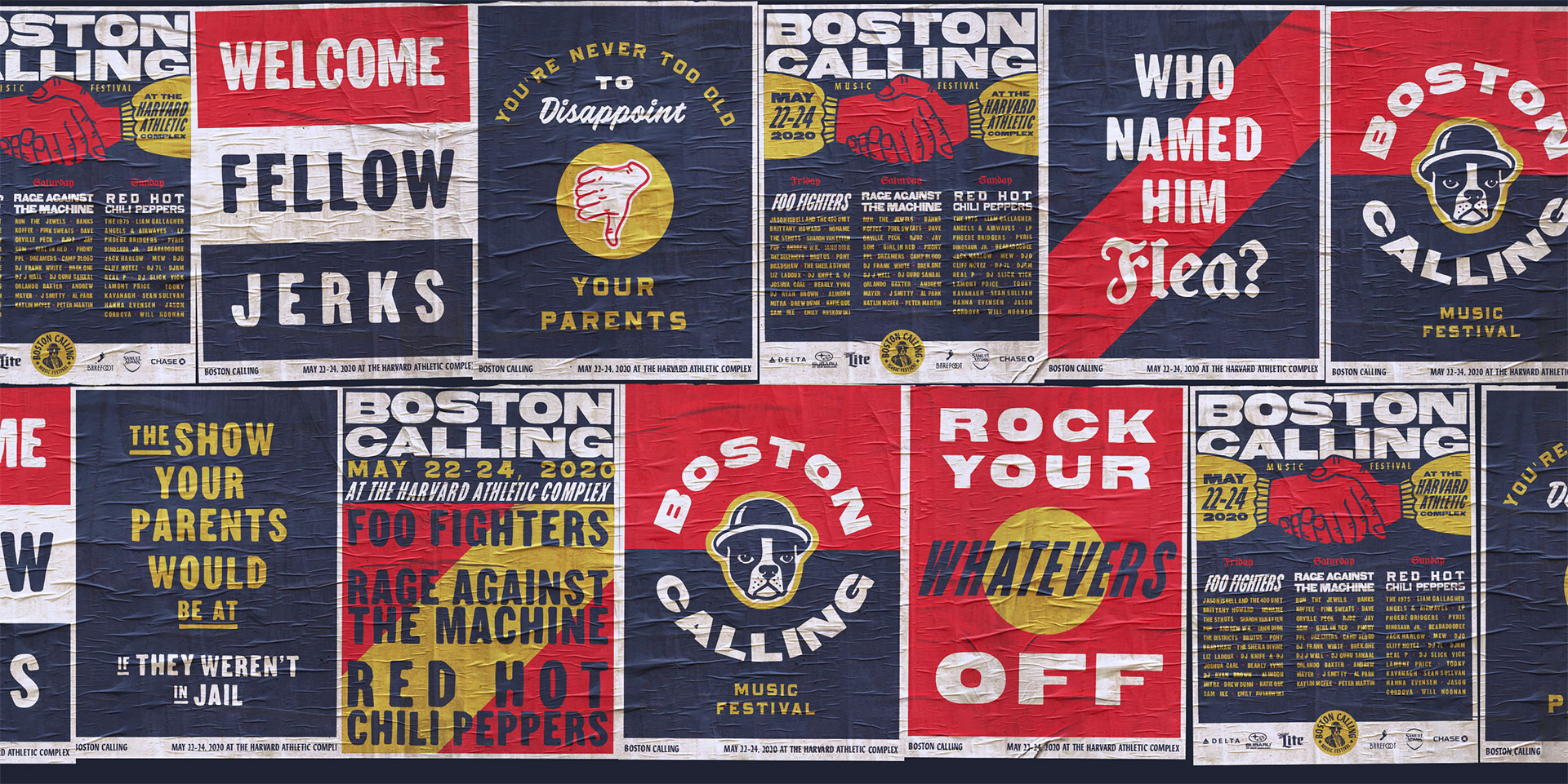
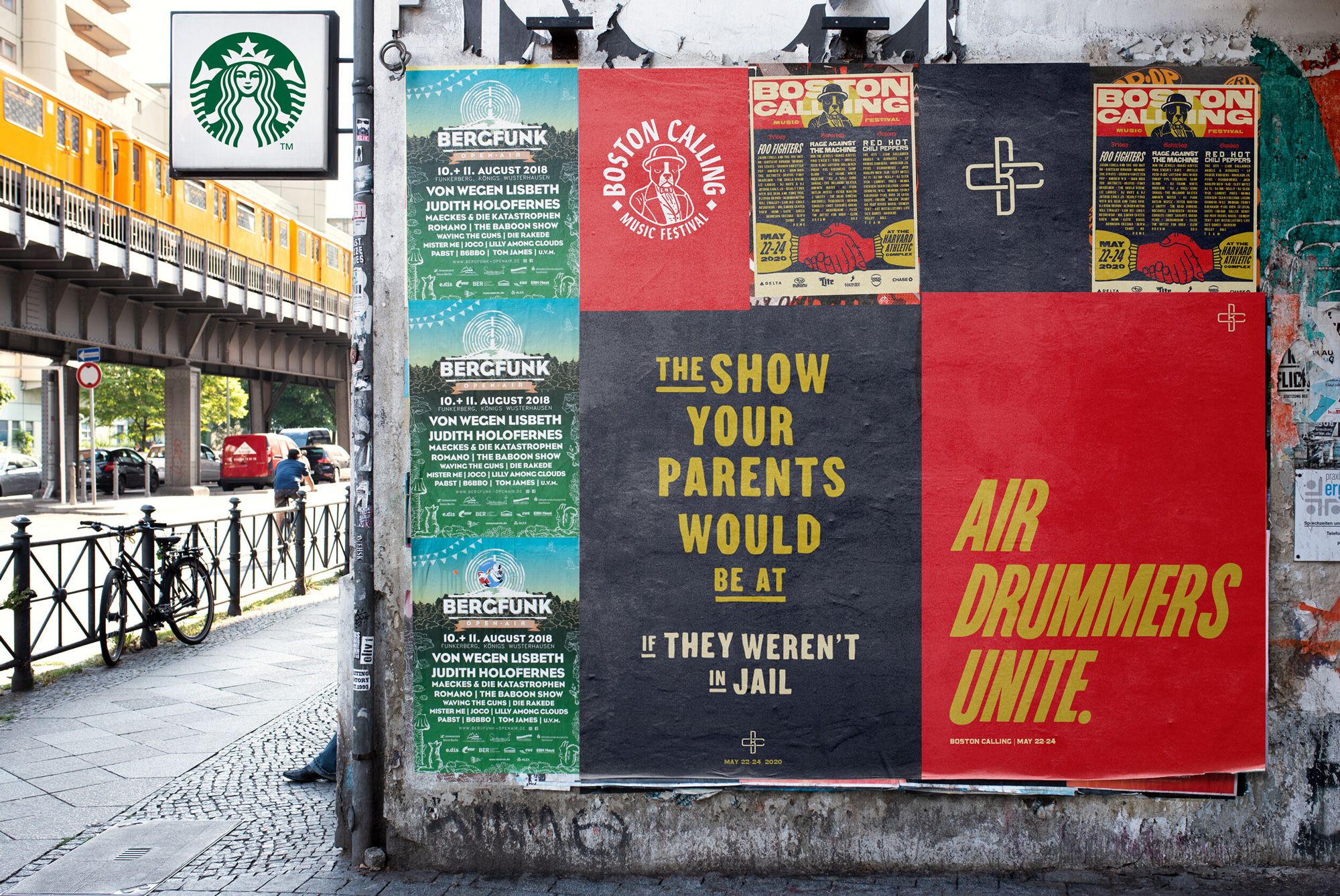
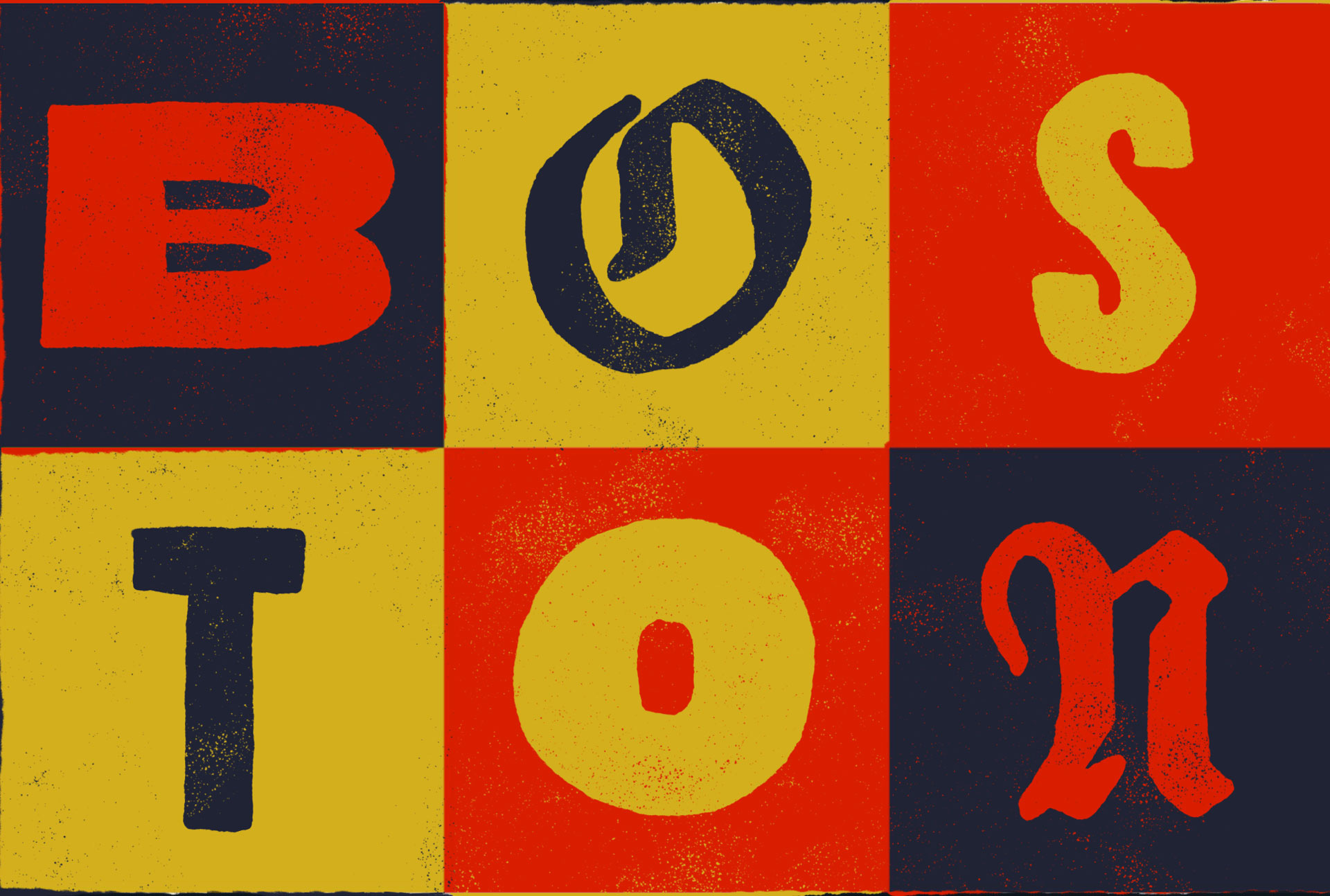
The applications are almost like a music festival in themselves, putting together different “acts” — in this metaphor the acts are typefaces, graphics, and even layout approaches — that are each unique and different but when experienced together there is a connecting thread in attitude and… to be honest, I sort of lost my own connecting thread with that metaphor so let’s bring it back to a more normal way of writing about identity. I love the variety and range of the applications and how they are unified by a pretty effective and moody color palette of muted red, blue, yellow, and white. At times, it may be one font too many but in an era of minimalism I’m not going to complain too much.
Overall, this is endlessly fun and cool to look at and it feels very appropriate as a Boston-centric music festival that’s a little rough around the edges and with attitude and confidence to spare.