From a storied, but often misunderstood organization
To an exciting, modern champion of the performing arts.
CHALLENGE:
Founded in 1938 by pianist and impresario Aaron Richmond, Celebrity Series of Boston was one of New England’s premier arts presenters. For more than 87 years, the organization has introduced Boston audiences to extraordinary performers across orchestral and chamber music, vocal and piano artistry, dance, and jazz in the city’s major concert venues. But the name "Celebrity Series" did not age gracefully and was often noted as confusing, misleading and sometimes, perceived as elitist to modern audiences.
STRATEGY:
Prior to making creative decisions, we spent several months surveying and interviewing more than 600 people. Working with a variety of audiences, venues and organizations, we worked to see past the programmatic structure typically expected of performing arts organizations. Instead, we focused on the visceral connection between audience and performer, prioritizing "feels" over format.
CREATIVE SOLUTION:
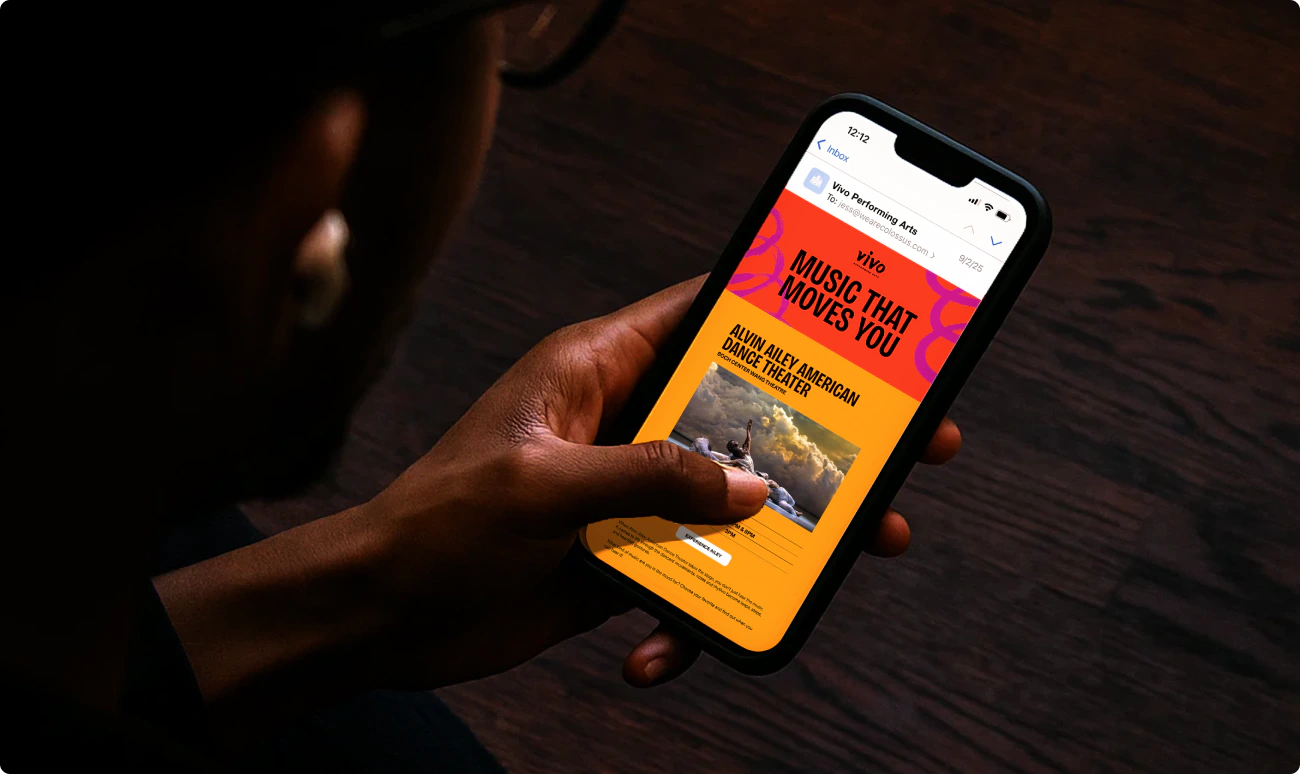
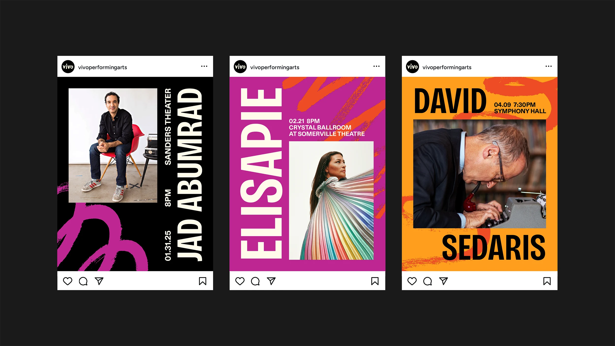
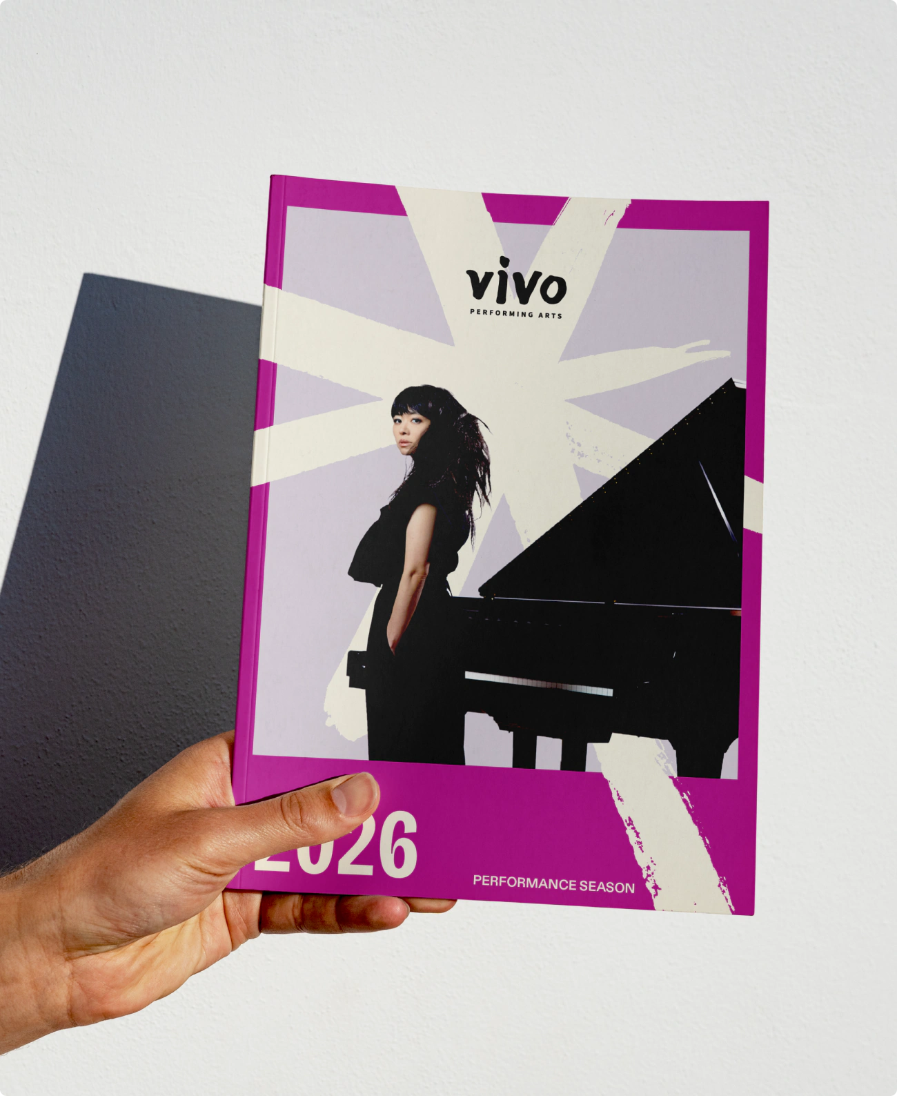
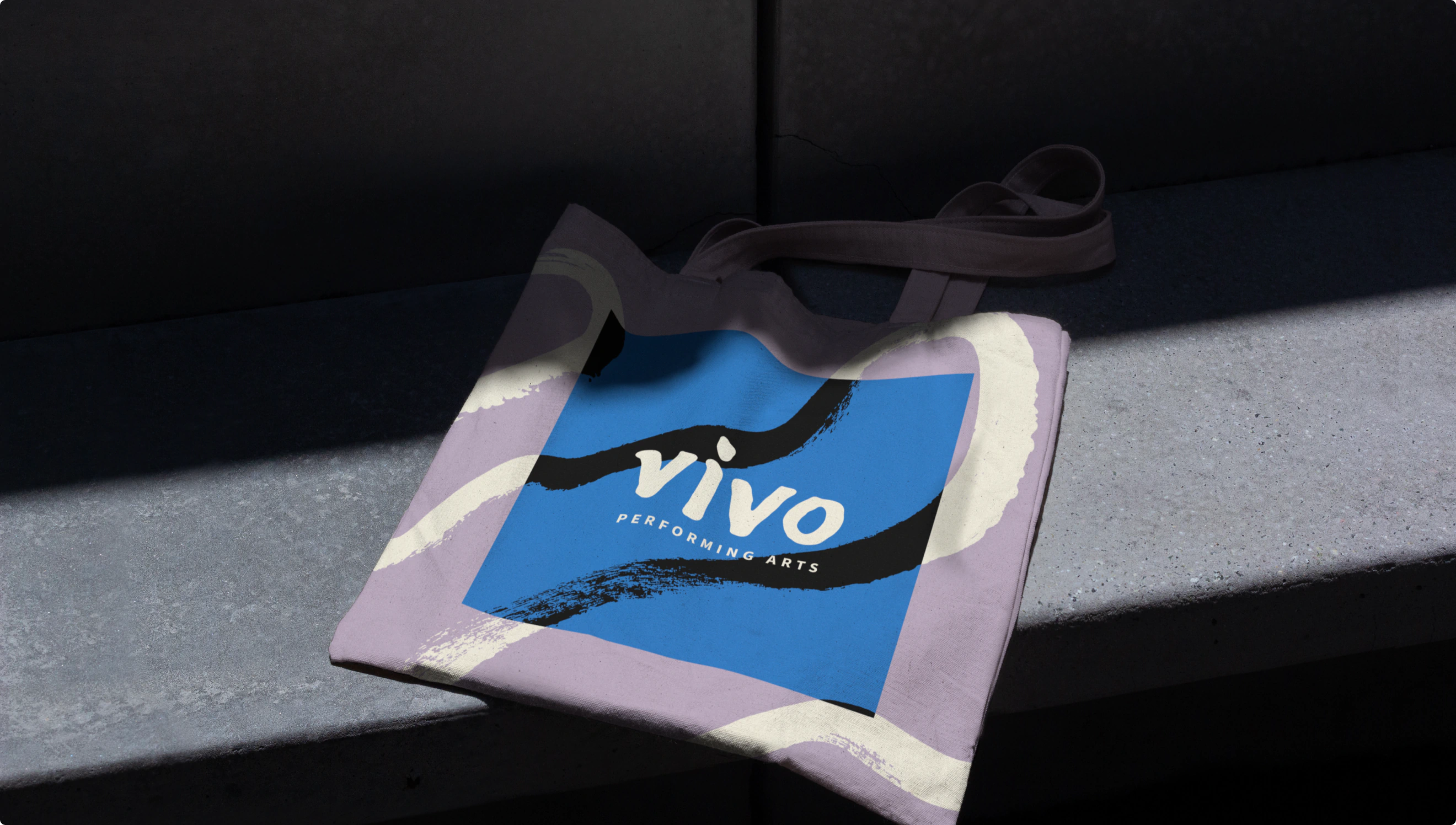
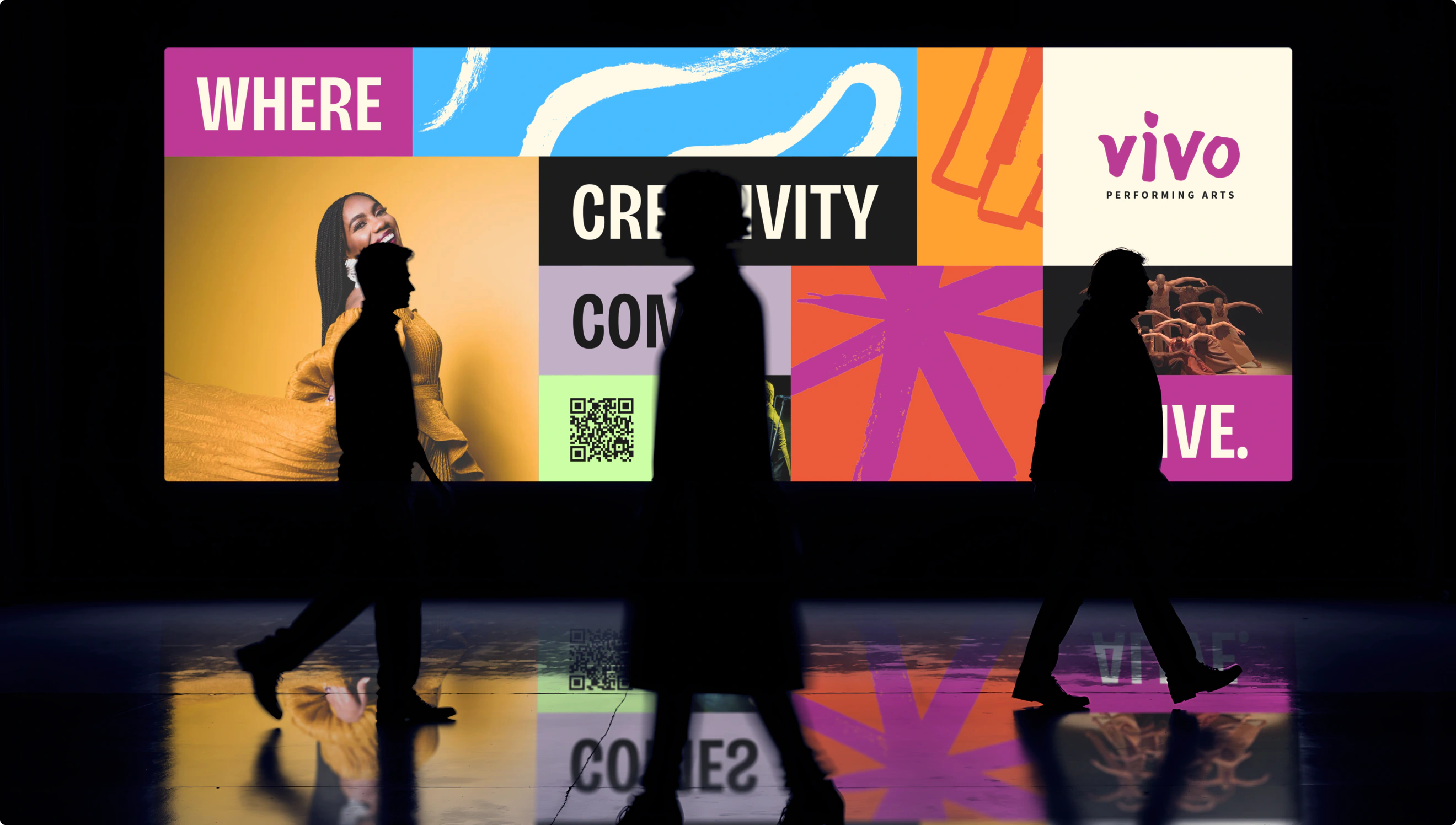
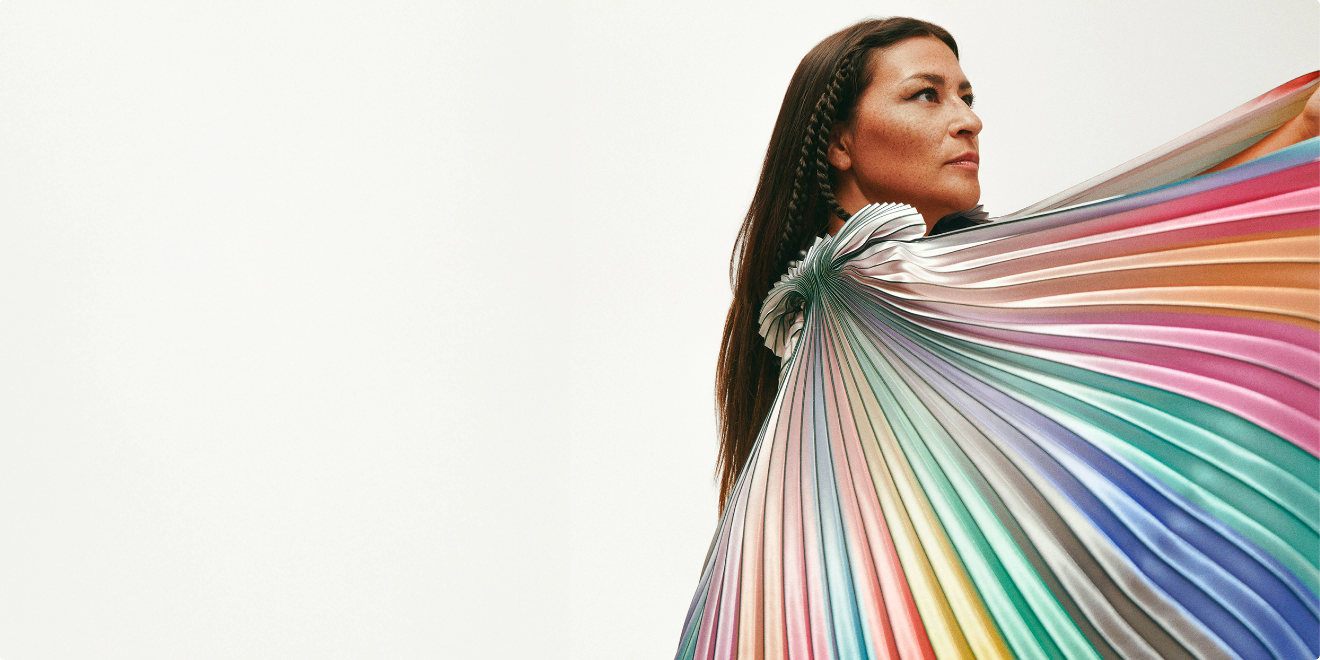
We renamed the organization and crafted a lively new brand identity. The name “Vivo” is derived from the Latin root vivere (to live) and is used in Spanish and Italian to mean “alive” or “I live.” It was chosen to capture the kinetic energy of the organization’s work, shifting focus from the static concept of “celebrity” to the dynamic, shared experience of artists and audiences coming together.
The rebranding journey into Vivo Performing Arts was an intensive process of research, listening, creation, and input-gathering. This effort was guided by strategic goals to broaden reach and diversify audiences. The team tested ideas with more than 600 survey respondents and conducted a series of in-depth interviews with more than 40 key figures, including artists, supporters, audience members, community partners, and peer arts organizations, all while maintaining endorsement from the Board of Directors.
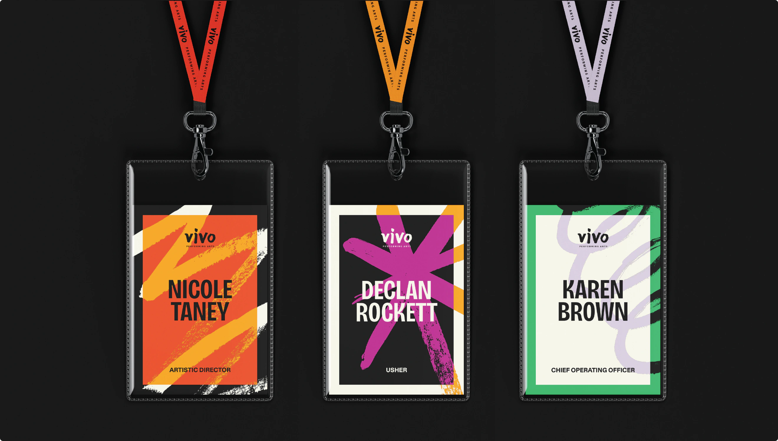
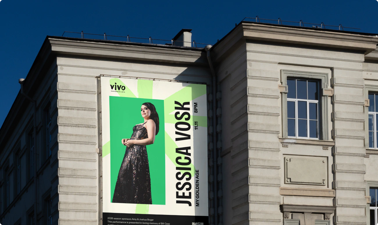
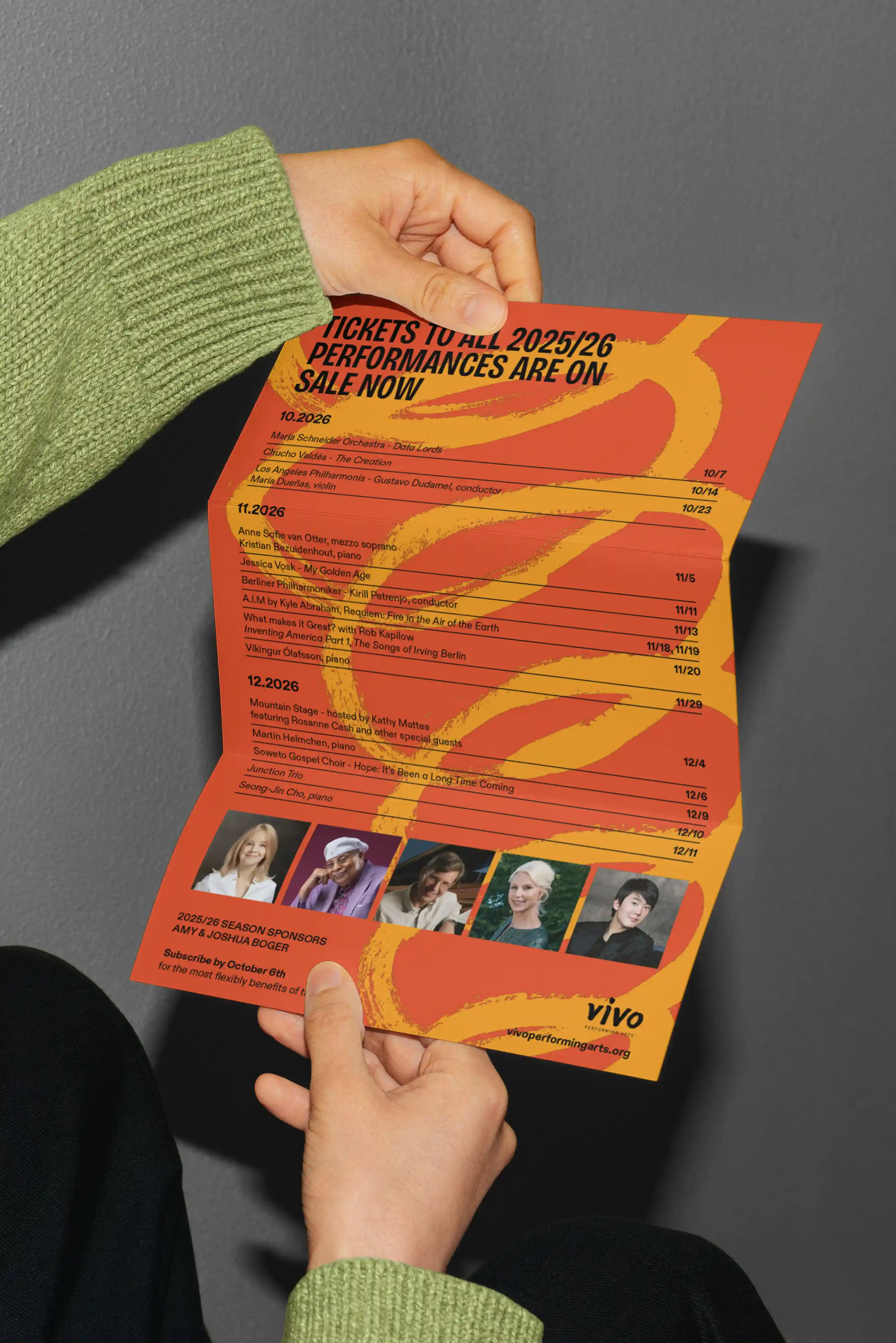
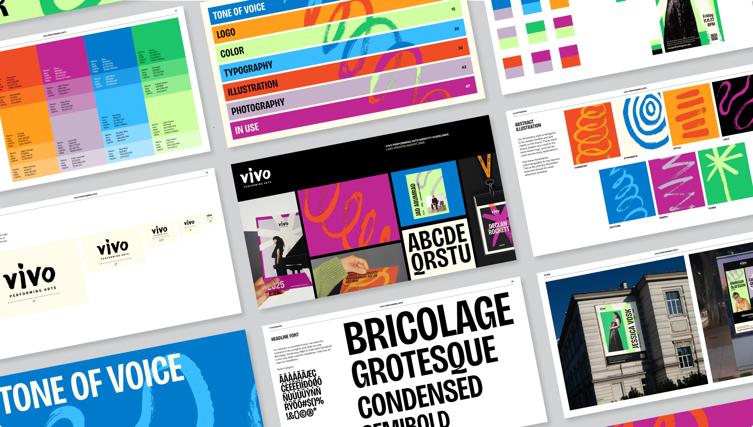
The design system utilizes a lovely combination of Bricolage Grotesque and ABC Diatype. Bricolage, a display face designed by Mathieu Triay, brings a unique, buoyant personality and is complimented by the clean, sturdiness of ABC Diatype from Dinamo. The two typefaces come together to support a system working to reinforce the legacy of the past, while simultaneously opening doors to new audiences. Type designer Mathieu Triay describes Bricolage as “a historical and cultural Frankenstein’s monster created from the DNA of Mayenne Sans and body parts pillaged from Antique Olive and Stephenson Blake Grotesques. Neither French nor British, neither historic nor modern.” This fusion of old and new personalities made it the perfect choice for a storied, 100 year old organization finding its voice in the modern era.
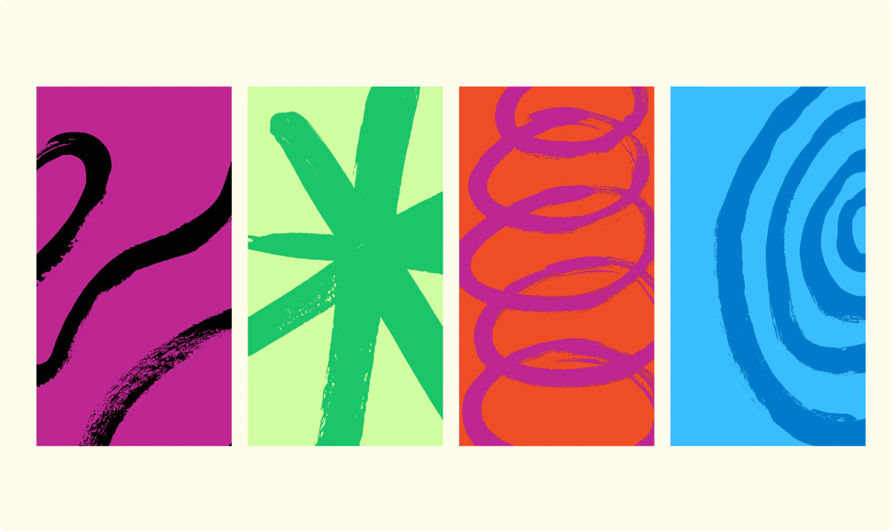
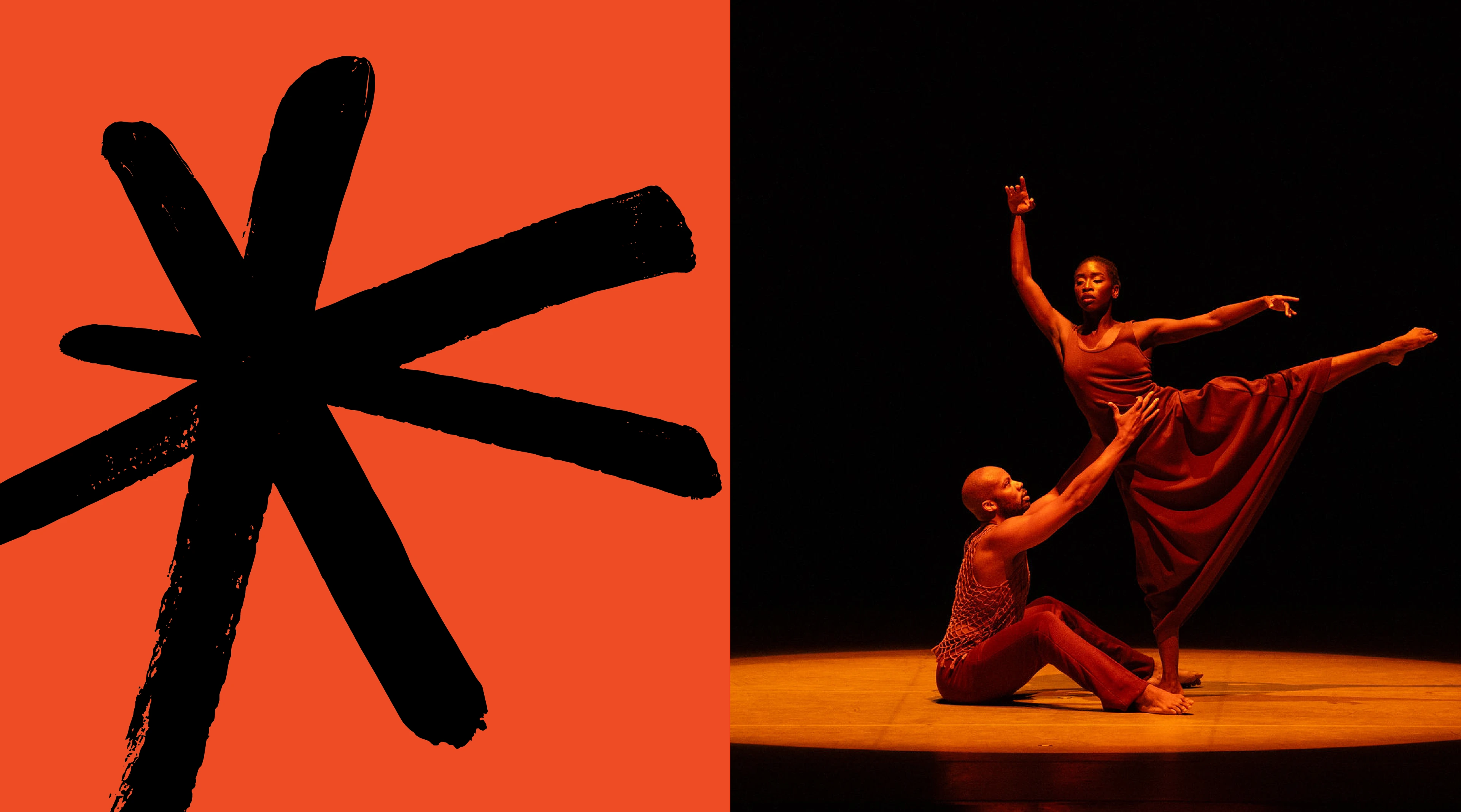
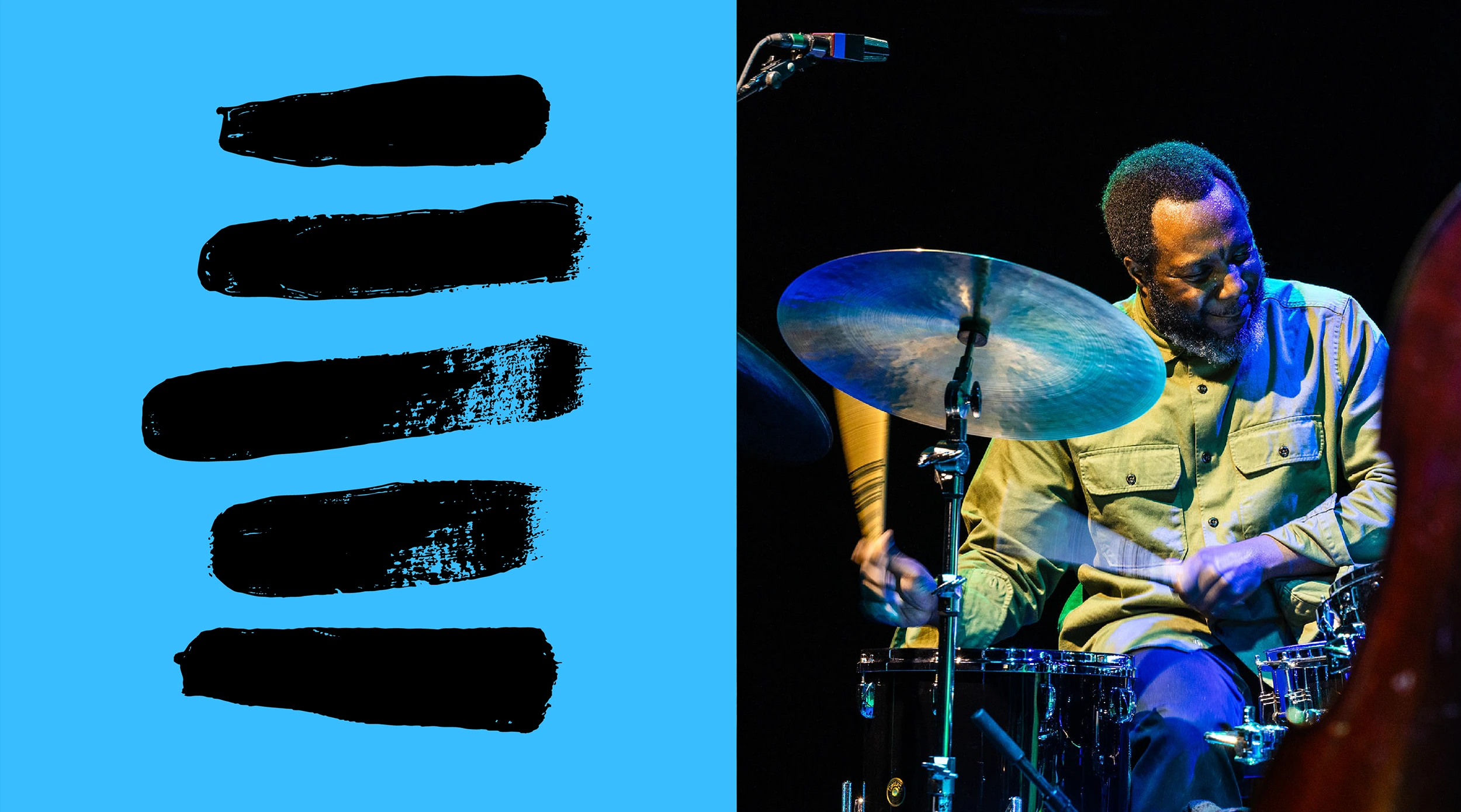
The Color palette for Vivo is notably saturated and vibrant, with monochromatic gradations for creating unique combinations and pattern overlays. Notably, there is no hierarchy in this color system. All colors hold the same weight and seek to reflect the immense variety in programming - music, dance, performance, etc- through a wide spectrum of color.
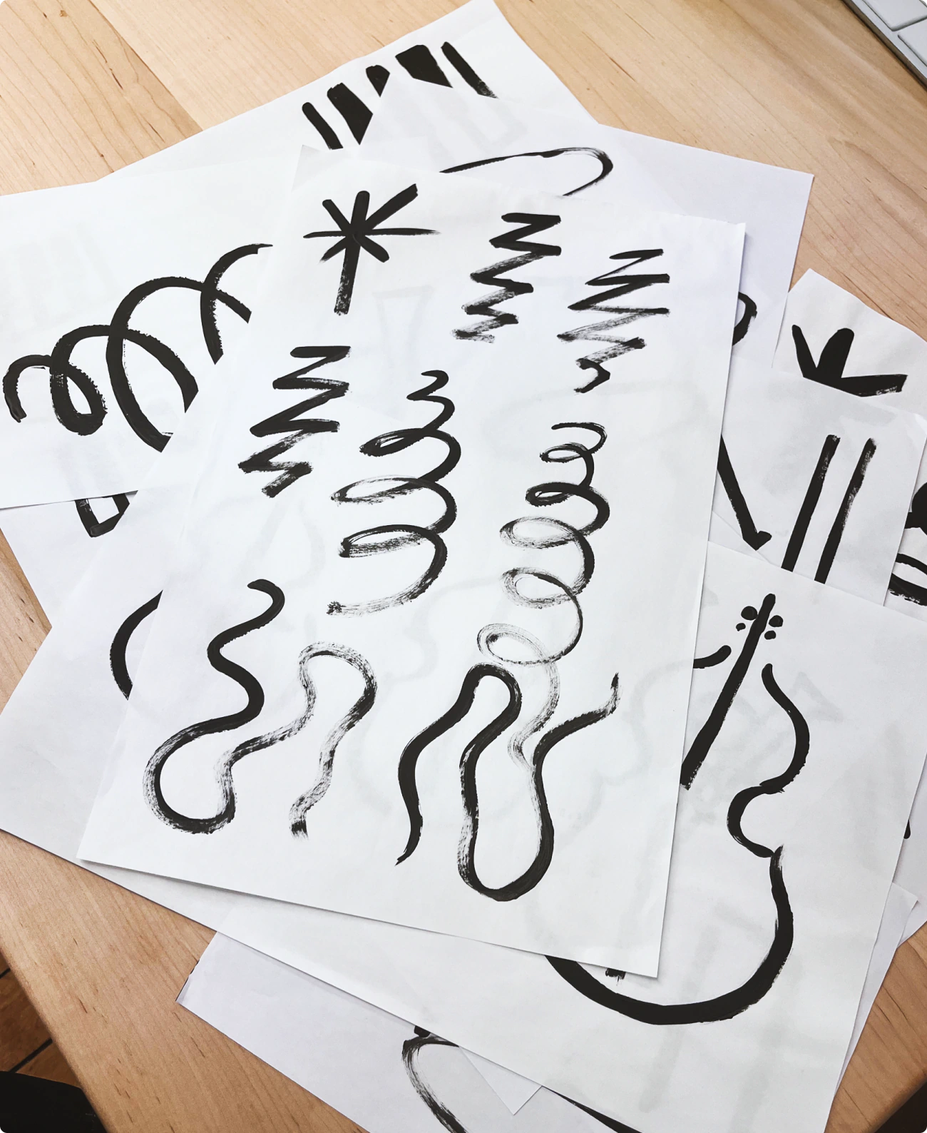
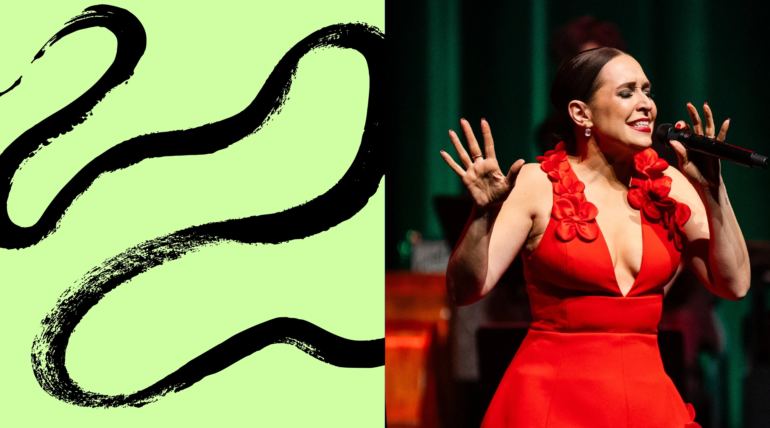
Illustrative swaths, swirls and swipes of paint were used to create an organic and imperfect graphic element for the design system. The design team at Colossus created a library of illustrations using acrylic paint on paper. Listening to a wide variety of musical compositions and genres, each illustration was made in real time based on “feeling, rather than form”, capturing themes like rhythm, tempo, swell, harmony and more.