CHALLENGE:
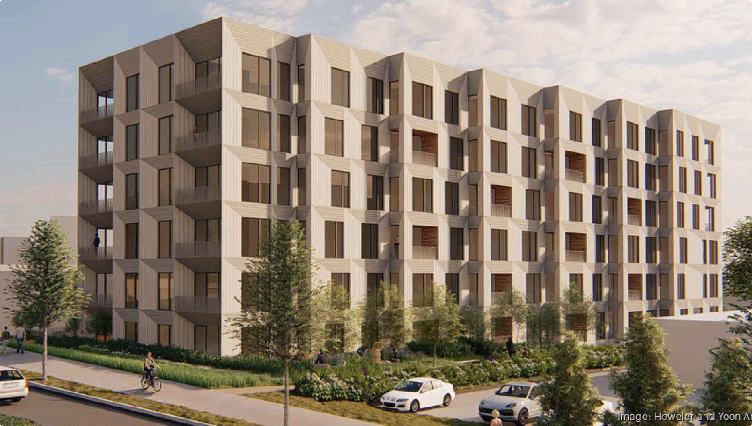
Located on Soldiers Field Road, alongside an ongoing cycle of construction and development, and close to many similar multi-family offerings, The Charley needed to find a distinctive place amongst its competition. Our clients at Berkeley Investments were looking to create an identity for a sophisticated, riverside multi-family residence that stood apart from the existing cookie-cutter apartments of the neighborhood.
STRATEGY:
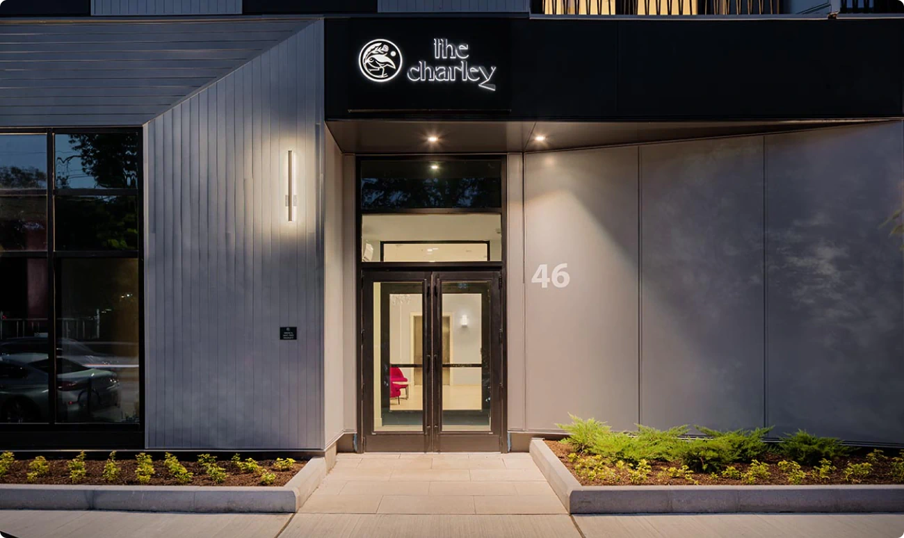
Designed for discerning residents who value style, character, and perspective, The Charley leans into the uniqueness of its exterior architecture - combining modern design, thoughtful details, and a connection to the Charles River, with a unique design perspective and urban attitude.
CREATIVE SOLUTION:
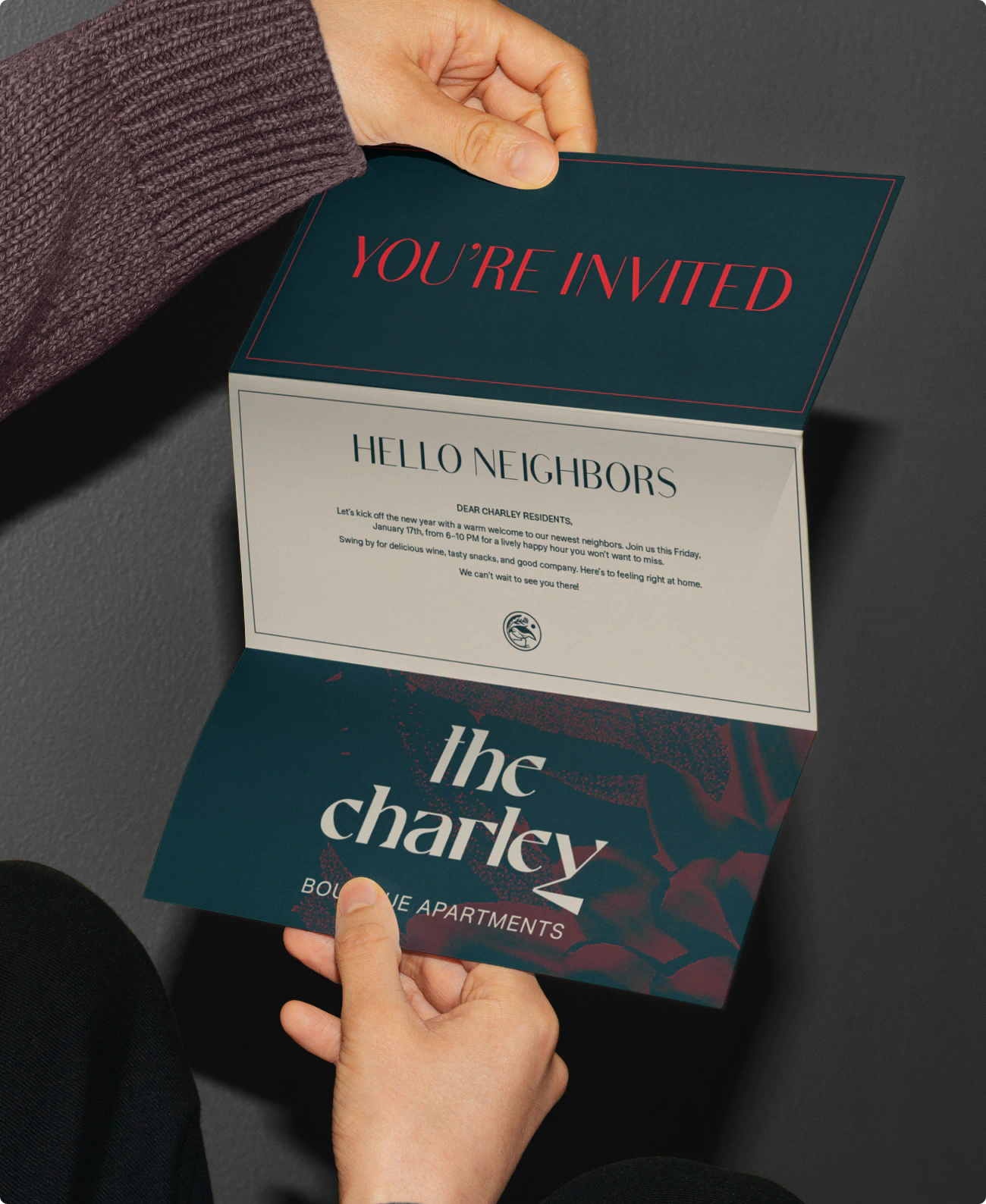
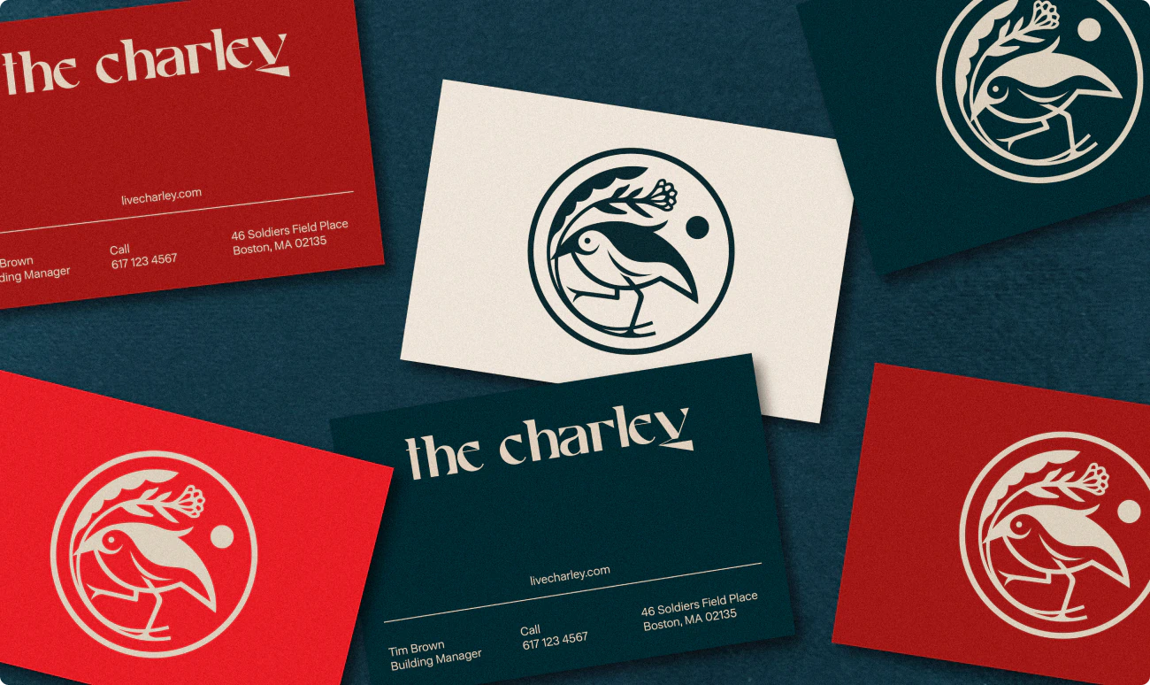
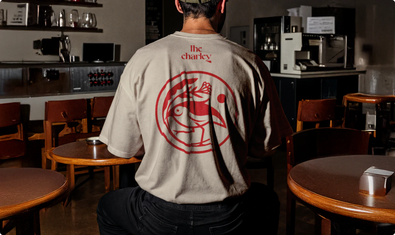
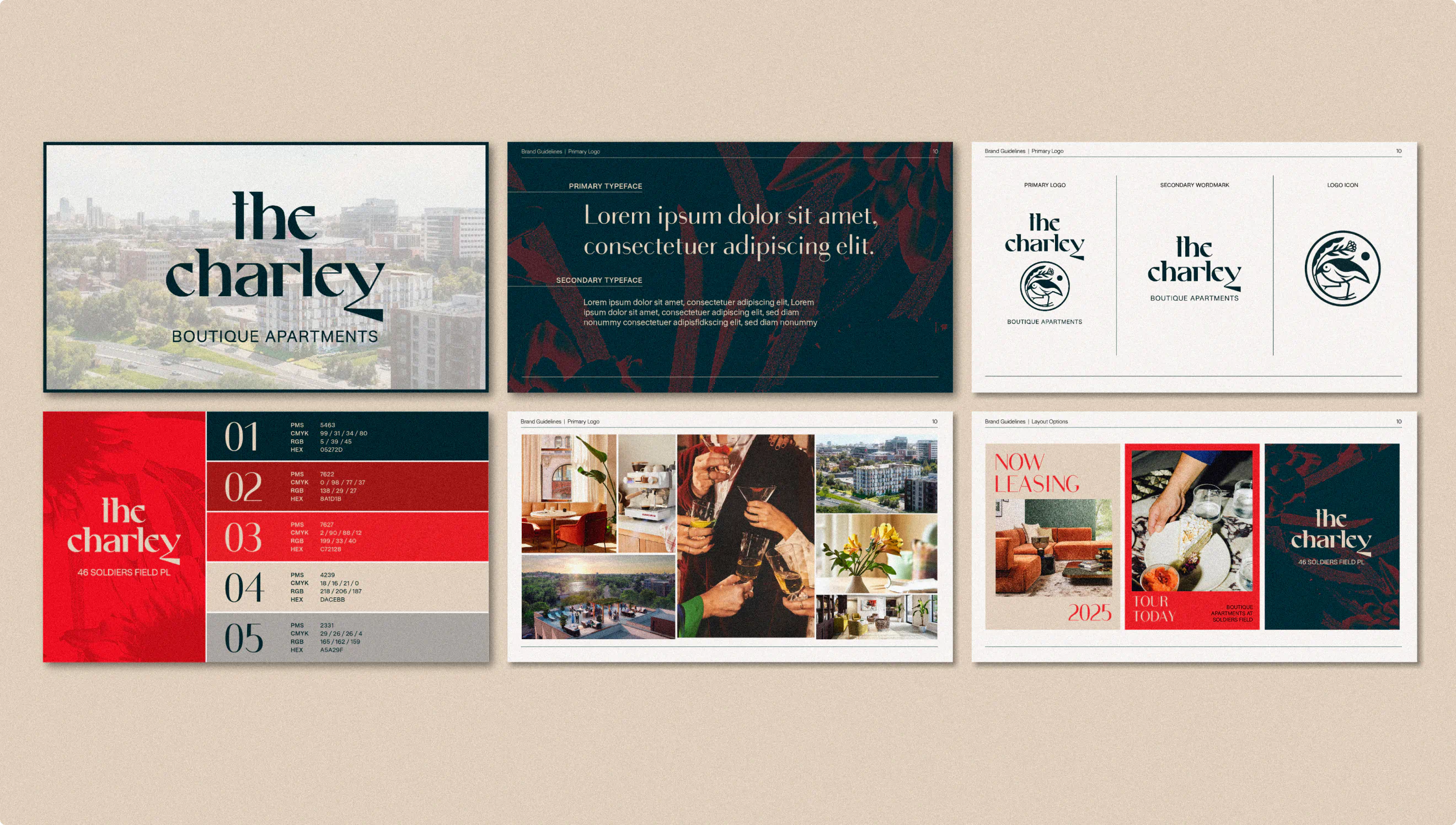
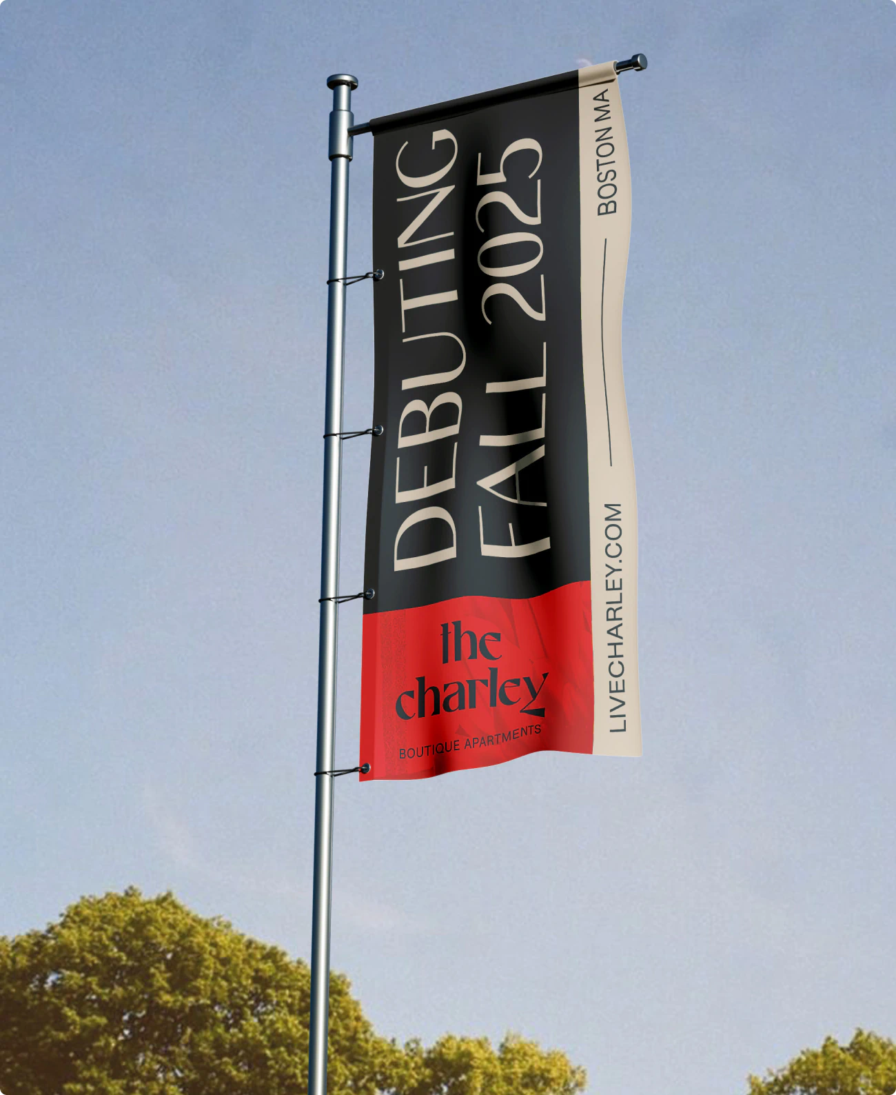
We crafted a brand identity as distinct as the building itself. Designed by Howler + Yoon to rise above its generic neighbors, the identity combines bespoke typography, a deep, moody color palette, and a hand-drawn bird logo — a symbol of playful sophistication and individuality, and a nod to the flora and fauna across the street on the banks of the Charles River. Every detail signals that The Charley isn’t just another standard apartment building; it’s a place with unique personality and presence, built for those looking for thoughtful design and character.
COLLABORATORS:
Howler + Yoon
Berkeley Investments
Anja Park