Long John Silver’s New Chicken Logo—What Designers Like (And Don’t Like) About The Refresh
It’s a chicken-loving world, and Long John Silver’s is looking to be part of it.
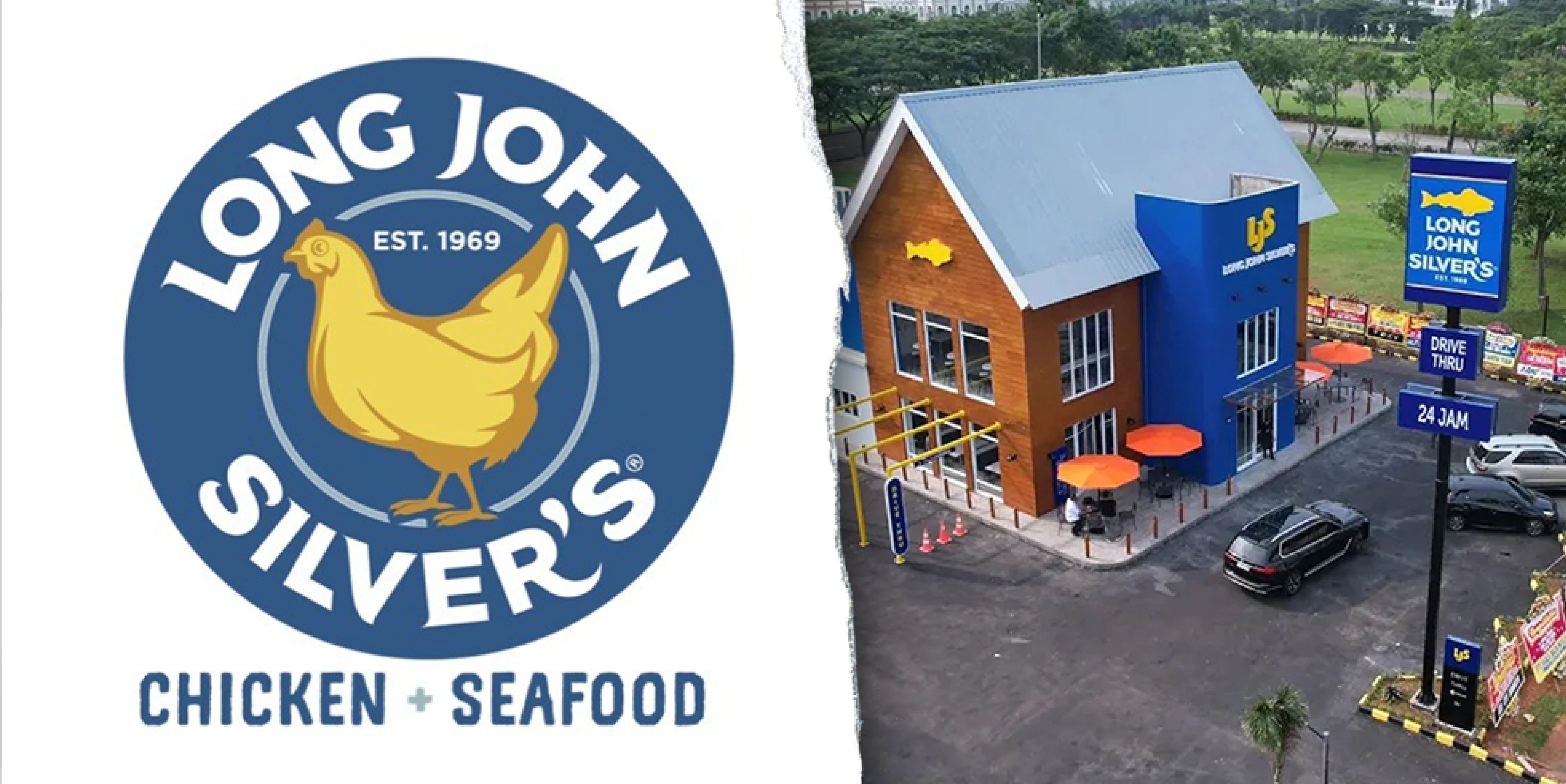
The chain known for fried seafood recently changed its logo, swapping out a fish for a chicken to highlight its chicken offerings.
In a press release announcing the change, the brand said the logo would appear on digital platforms and that Long John Silver’s Front Row Motorsports car would be newly wrapped with the updated mark. Long John Silver’s serves “chicken planks”—what it calls chicken fingers—and started serving chicken wraps last week.
Long John Silver’s joins other brands leaning into poultry. McDonald’s brought back its McCrispy Strips and Snack Wraps, while Taco Bell has rolled out chicken nuggets. Even pizza brands have been highlighting their wing offerings—Pizza Hut, for example, has taken aim at Wingstop and started a “Wing Wednesday” deal.
The brand’s internal team designed Long John Silver’s new logo. It’s not clear whether the change is permanent or temporary.
“Long John Silver’s is exploring new ways to spotlight all the flavors our guests love,” said a brand spokesperson. “The addition of the chicken mark to our logo is part of that evolution. While we’re not able to share specific details on how long this change will last, we have several exciting updates on the horizon and will share more soon.”
For some, a temporary logo would be a more interesting marketing move.
“This is genius if it’s a short-term, reversible provocation to spotlight their “best-kept chicken” story, especially as so many heritage refreshes have misfired,” said Mike Foster, founder and creative director at Straight Forward Design. “If it’s permanent, it’s madness as it is trading seafood distinctiveness for generic chicken.”
For others, the logo works for conveying to consumers that Long John Silver’s is striving to be a chicken-focused brand.
“It’s strategically super smart. How do you tell the fresh story of a company famed for fish and chips? Sure, you could do a lengthy ad campaign,” said Pum Lefebure, chief creative officer and co-founder, Design Army. “But Long John Silver’s just switched the icon from fish to chicken. And bam—just like that, they’ve communicated everything that needed to be said.”
Ad Age reached out to several design pros who were not involved in Long John Silver’s logo overhaul to get their take on the changes. The experts share their opinions below on each facet of the change. (Responses have been lightly edited.)
The chicken
Travis Robertson, co-founder and executive creative director of Colossus: First of all, let me say that I hate publicly criticizing anyone’s work, as the general viewing audience (like myself) has no idea how many buzzsaws, board meetings, focus groups, revision rounds and axe-cutting this work went through. While I appreciate the desire to position chicken front and center, it does feel slightly disconnected from the seafood qualifier without the presence of something nautical. After all, this was a brand named after a character from Treasure Island and built on the shoulders of fictional pirates. I wish the designers had hidden ocean waves in the chicken feathers or leaned a little heavier into the porthole container. Something to help connect the dots.
Christy Lebor, partner and head of the strategy group at SmashBrand: Swapping the fish for a chicken is a major identity misstep. The fish wasn’t just a mascot—it was shorthand for what Long John Silver’s is. Replacing it with a chicken visually confuses more than it helps in my opinion. If the goal was to broaden the menu, the smarter play would’ve been to remove the animal icon altogether and let the words “Chicken + Seafood” carry the expansion.
Foster: Dropping a chicken into the existing roundel in the same style, a lot of people won’t notice. The chicken is facing the opposite direction from the fish, which hints at a change of direction. The illustration is competent and consistent with their house style. If this is 4D chess, I love it. If not, it’s weird.
Lefebure: It’s the simplest update—I like it because it’s no BS. Cut the crap, get to the point. Keeping the same typography and established blue and golden-yellow branding, that simple icon update moved the company in an entirely new direction.
The circular design
Lebor: The circular badge design gives it a modernized, QSR-friendly structure that’s easy to use across packaging and signage. The typography is strong, and I like that they kept the color palette for brand consistency.
Foster: As a permanent identity, it fixes the one thing that wasn’t broken—distinctiveness. The fish was an asset; a chicken makes them blend into a crowded category. The roundel now feels over-stuffed (name curves, EST. 1969, icon, descriptor), which hurts glanceability. If they use this as a stunt, while keeping the fish across the ecosystem, it is such fun.
The typography
Sean Barrett, partner and creative director at Studio Mega: The ‘Chicken + Seafood’ at the bottom seems to be there to counterbalance the rather bold choice to move from a fish logo to a chicken logo by saying “Hey, we still serve fish too!” but visually it feels a bit more like a quick fix than a long-term solution.
Matt Sia, executive creative director at Pearlfisher: It’s difficult to gauge the purpose behind a rebrand like this without knowing the brief, but this was a missed opportunity to craft meaning into the elements—the seal, type, and iconography all feel generic. The circular badge and serif flourishes could’ve been refined to feel more intentional or rooted in the brand’s history. The color palette could have introduced a fresh vibrancy. Even the secondary typeface feels completely disconnected, more theme-park Tiki than timeless.
Robertson: The “Chicken + Seafood” qualifier underneath feels like it was invited to the party last minute. The type is slapped on, with erratic kerning and the use of a pre-distressed typeface, especially as a part of a logo mark, makes me sad.
Lefebure: The logo alone is solid. But I wish the bottom “Chicken + Seafood” typography was better integrated. Possibly in the context of food packaging and other mediums, it could work, but right now it feels a bit “stuck on” beneath the logo.
Brand strategy
Sia: It definitely signals a pivot—possibly toward a new audience, leading with chicken—but at the cost of its seafood credentials. If that’s true, it feels risky. Moving away from what made the brand loved—its crispy fish and chips, its seafaring nostalgia and almost kitschy and spirited character—could weaken the emotional equity they’ve had that I remember from my childhood. I grew up with this brand. My dad loved their fish and chips. We used to go there for their seafood, the crunchy pieces of batter that lined the plates and the hushpuppies. Those memories still hold warmth, and this rebrand feels like it’s cut the line to that emotional connection.
Lebor: This feels like a brand searching for relevance rather than owning its distinctiveness. If I were them, I would have doubled down on their heritage in comfort food/fried foods, and in particular, for how light yet crispy their fried batter is. I’d own “crispy” if I were them... crispy for all proteins. That would be much better than trying to hero a chicken and “poke the bear” of KFC and Popeyes while potentially losing your core fried fish consumer.
Foster: If it’s a managed provocation, it says they understand attention economics: spark debate, make the chicken famous, then re-center the fish. If it’s a genuine repositioning, it’s risky—chicken is ubiquitous; seafood distinctiveness is rare. Either way, a logo alone won’t change habits.
Lefebure: Famous for fast seafood, this direction is a clear, bold move. People have long loved the restaurant for its affordable, tasty fried fish. Chicken definitely doesn’t “ring” a bell (no pun intended) when you think of Long John Silver’s. But with the new design, the message could not be more direct. Not to mention, it’s got everyone talking, which makes the marketing strategy even smarter. Now they just have to live up to the logo—that chicken better be good!
Robertson: There is something to be said for conviction. It’s chicken or bust for Long John Silver’s. Whether it makes sense or not, they are going all in on the bird. Fish be damned.