Boston Lyric Opera Gets Dramatic New Look
A new identity by Colossus draws parallels between opera and contemporary cinema, and helps set the stage for the institution’s 50th-anniversary.
Boston Lyric Opera has unveiled a new visual identity from Colossus as the cultural institution celebrates its 50th-anniversary season. The identity will appear across print, digital, experiential and other brand touchpoints, reaching audiences primarily in Boston alongside the opera company’s broader national following.
Founded in 1976, Boston Lyric Opera has spent five decades bringing venerable theatrical traditions to New England audiences, with a modern twist. The anniversary gave the company an opportunity to sharpen its visual language for a contemporary era while building an identity sturdy enough to stretch across future seasons, platforms and productions.
Opera and film may sit in different seats, but both fuse music, visual design and performance into heightened human stories. Colossus found a particularly useful parallel in production and distribution companies whose distinct points of view have helped make bold, emotionally charged storytelling culturally magnetic for younger audiences.
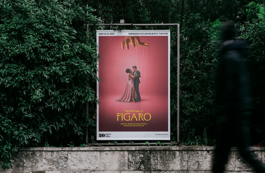
”There is a renewed artistic appeal that has been created by the rise of modern production and film distribution companies with a real perspective, A24, Monkeypaw, Neon and others,” said Colossus ECD Travis Robertson. “Many of the themes you see in cinema cross over to opera beautifully. Remove the format and you’re left with many of the same narrative pieces.”
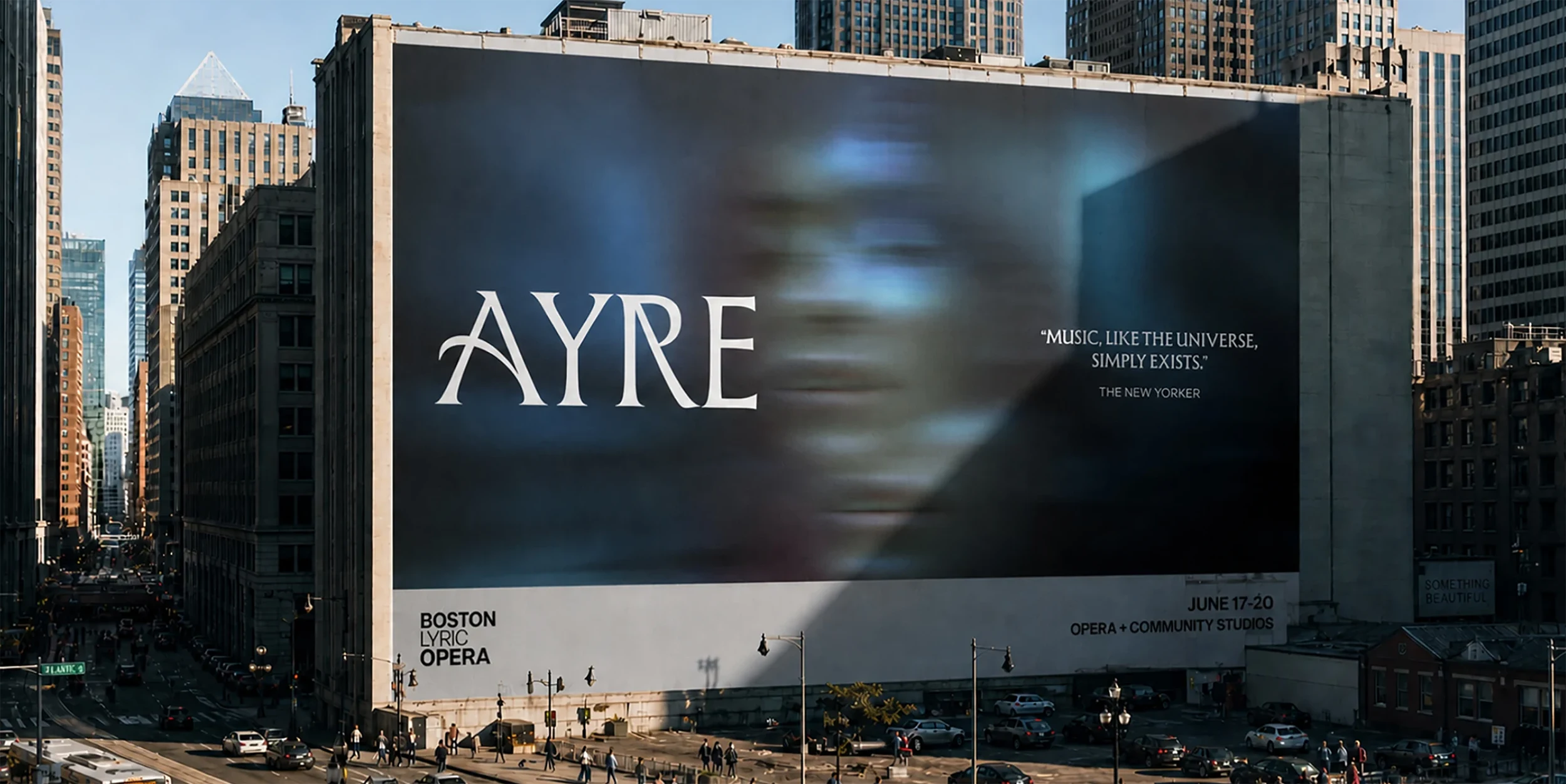
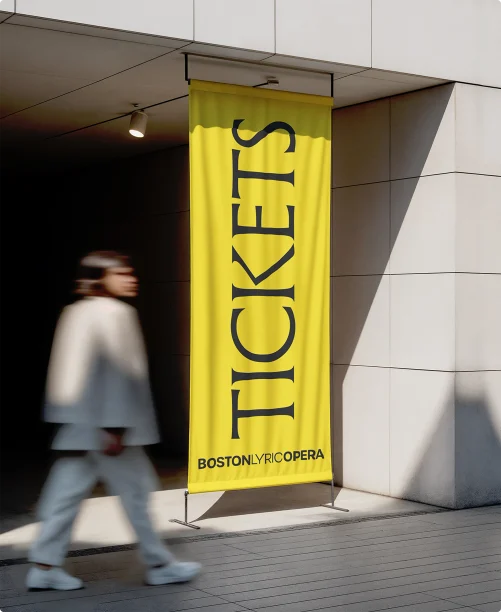
That connection extends through the identity. A crisp grid and oversized, masthead-like titles evoke cinematic posters for piece of collateral, while abstract photography and imagery address plot themes without flattening them into literal scene-setting.
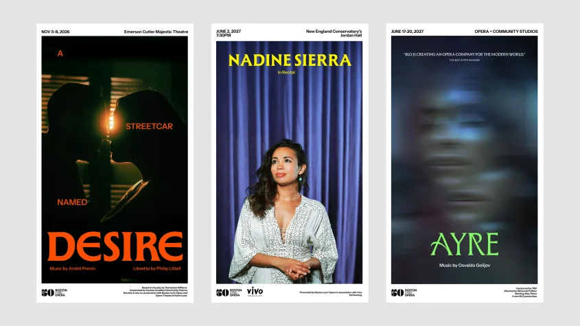
The visual system works primarily in black and white, punctured by flashes of neon yellow, green, pink and red. Those spot colors, explains Robertson, provide a controlled electric charge while preserving the minimal, predominantly duotone character of the work.
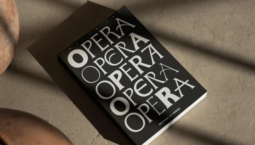
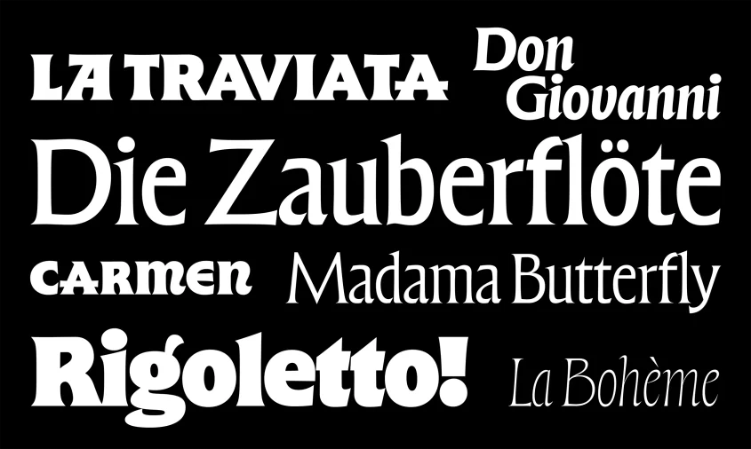
Typography supplies much of the identity’s dramatic range. The system leans heavily on James Edmondson’s Forevs family OH no Type Co., which allows the design to bend around the emotional temperature of each performance and medium.
Colossus also created a commemorative 50th-anniversary icon, while leaving BLO’s existing logo largely intact. The result gives the institution a recognizable anniversary marker and a broader identity system designed to continue working after the candles have been blown out.